| Image |
Comment |
| 05/22/2012 10:13:27 PM |
Autum-Harvestby TrompieComment: I was sure this would finish higher. Like Abra said below - it was probably overlooked too quickly by too many voters. Keep it up! |
 Photographer found comment helpful. Photographer found comment helpful. |
| 05/22/2012 10:05:25 PM |
Autumn through the eyes of a Child by RianBotesComment: Way to go Rian. Taking a little break clearly hasn't done any harm to to your photography skills! Thanks for the story even though I knew some of it already - I can see why this shot meant to much to you... and a ribbon whose colour matches the shot perfectly! |
| Photographer found comment helpful. |
| 05/15/2012 10:06:24 PM |
Corn Fieldby AmmieComment: Yes! You just had to do well with this challenge Amanda and you didn't disappoint! Lovely view - you are so lucky to see this every day. The flow of field to the tree and the layers in the BG work very well. Well done |
| Photographer found comment helpful. |
| 05/07/2012 09:12:28 PM |
Dawn Lightby AmmieComment: Awesome Amanda! Well done on a great finish in a FS. Keep up the great work. |
| Photographer found comment helpful. |
| 05/02/2012 04:06:11 AM |
Double Frameby AmmieComment: Mooi Amanda
I agree with Gaby and her cropping suggestion. I really like this shot and looks almost painted. Very arty indeed. Well done on a nice score! |
| Photographer found comment helpful. |
| 04/23/2012 11:34:48 PM |
Money can heal most thingby kasabaComment: Obviously this is a sentimental shot for you. Hope Flocki makes a super quick recovery!
As for a technical crit:
The focused area is perfectly placed for a pleasing composition. It took me a while to work out that the head is on the left looking in the general direction of the leg.
The OOF areas and the white areas around the border add to the feeling of waking up from an operation and being half conscious / drugged. It works well here. I didn�t vote on this shot but probably would have given it a 6. It looks like a nice snapshot that you edited nicely and colours and PP effects work well but it is not an amazing shot that takes my breath away.
Not sure how you could have improved on this image with PP. You did well with what you had but the voters probably didn�t connect with it and as Vawendy said - it is a bit of a stretch to connect to the challenge topic even if it did cost a fair bit to have this procedure done. Voters don�t seem to want to think hard about something. It must be there in their face and easy for them to give a high score to within the 5 seconds that most people seem to spend looking at a shot. |
| Photographer found comment helpful. |
| 04/19/2012 01:56:01 AM |
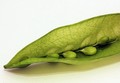
Peas in a podby kasabaComment: All the 1's, 2's, 3's and maybe even the 4's will be the people that take the challenge description very literally. If you had taken the extra peas out so that there were only 2 left in the pod this would have scored above 6 guaranteed!
Composition works nicely and the leading lines take you up the page from bottom left to top right, right past the main subjects - the peas! Well done.
I can tell by the shadows there were two lights above the pea pod. It really helped to bring out the detail in the transparency of the pod and I like it a lot. The shadows could have been a bit softer by using something to diffuse the lights between the subject and lights like white paper / white sheet etc. That would make the shadows have less of an "edge" and be more pleasing to the eye.
You shot it on ISO 200 - try go for 100 wherever possible. DPC hates noise and although 200 ISO shouldn�t give that much noise I see a fair bit here. Perhaps your original was quite a bit darker and you brightened it a lot in PP - that also adds a lot of noise. If I'm wrong then I'm stumped???
DPC also loves smooth soft even backgrounds. Your white BG looks a bit yellow on my screen and is a little "textured". It might be due to some noise but probably the type of BG you used for the shoot. I see some dust spots bottom left and top right that can be cleaned up in advanced editing. You can also remove the little bits of pod that are sticking off like threads. I'm telling you now some people would mark you down a point or two for that! Its better to remove it before the shot is taken the PP is easier. |
| Photographer found comment helpful. |
| 04/19/2012 01:34:43 AM |
Deceptive Beautyby kasabaComment: Macro isn't my thing so take this comment with a pinch of salt...
As the others have said below there isnt anything / much in focus. DPC loves sharp focus and on macro shots it is even more important. Yes shallow DOF was required for this challenge but something clearly needed to be in focus to qualify for the speed voter that rushes through and votes on a photo in less than 5 seconds.
I see your apperture was 5.6 - you might have wanted to try and shoot it at more like f/16 or smaller to increase the DOF you would get... the counter side of that is that you either need a longer shutter speed or higher ISO. If this was handheld then it would also be a reason why it is not pin sharp - 1/13 of a second is pretty slow for this type of work. It needs to be nearer 1/200 sec to keep the image from being blury.
It is a nice abstract looking shot but abstract normally doesnt do too well here... that is if you are worried about the scores. |
| Photographer found comment helpful. |
| 04/19/2012 01:27:42 AM |
Apocalyptic Sunsetby kasabaComment: Hi Gaby
Yes - No 1's or 2's. Always a good thing but even the best of shots and winners of challenges get 1's for reasons I can�t understand but some voters obviously have different tastes to what the majority do and we have to just accept it.
Your decision to leave just a hint of detail on the FG hill was probably what got you over the 6 mark - might have been a bit better with a bit more detail but we will never know now :-).
Composition wise - things are set out nicely and fit into the "thirds rule" nicely with the land on bottom third and the rays coming out of the lower left third intersection.
Seeing as it was advanced editing I would have added some Gaussian Blur to the sky. I see you shot it at ISO 400 and there isn�t terrible noise but I would make it smoother than it currently is. The sky could do with some more contrast (many ways of doing this) to make the rays pop out a lot more.
Sharpening on the clouds looks fine but the horizon looks a bit soft. Some more sharpening is required there.
Need anything else? Give me a PM |
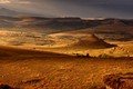
| 04/18/2012 04:51:05 AM |
...there are Mountainsby AmmieComment: Hey Hey! Look who is in 6th place... but should move up to 5th and a HM with the current Blue probably going to get a DQ! Well done Amanda. Lovely image, gorgeous time of day to get a shot and the light just emphasises the depth and contours of your back yard :-)
Lovely! |
| Photographer found comment helpful. |
Home -
Challenges -
Community -
League -
Photos -
Cameras -
Lenses -
Learn -
Help -
Terms of Use -
Privacy -
Top ^
DPChallenge, and website content and design, Copyright © 2001-2025 Challenging Technologies, LLC.
All digital photo copyrights belong to the photographers and may not be used without permission.
Current Server Time: 04/19/2025 08:34:48 AM EDT.