| Image |
Comment |
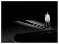
| 10/21/2003 08:13:02 PM |
An Actor's Solitudeby Spanish_GreaseComment: great shot - would have done well in the lighting or shadow comps as well. Like the shadow, and use of negative space. Looks like the subject is looking at the camera - my only suggestion would be to have him look down or out into "emptiness" to help convey "alone" more (read: if he's looking at you - he's not really all that alone with you there - but if he's not looking at you - we the viewer have to give some willing suspension of disbelief that he is alone). Nice work. 9. |
 Photographer found comment helpful. Photographer found comment helpful. |
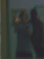
| 10/21/2003 08:00:24 PM |
Nightime Reflectionsby genmpComment: nice idea...but a tripod might help some. The grainess i like, but not the motion blur. The shadow is cool too - looks like a ghost or something behind what appears to be a girl - or the grim reaper with the pointy hat =`) 5 for effort. |
| Photographer found comment helpful. |
| 10/21/2003 07:56:47 PM |
H2O by kiwinessComment: wow. extra point for obvious hard work. cool pic. |
| Photographer found comment helpful. |
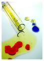
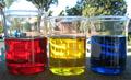
| 10/21/2003 07:56:18 PM |
Spilling scienceby jonpinkComment: very cool. nice idea for the different colors...at least i hope it was an idea =`) |
| 10/21/2003 07:55:05 PM |
Fiberby tkalectComment: i'd like to see more of a close up - but the pic is still very cool. nice work. |
| Photographer found comment helpful. |
| 10/21/2003 07:52:31 PM |
|
| Photographer found comment helpful. |
| 10/21/2003 07:51:23 PM |
Backyard Chemestryby CDSComment: i'd hate to recommend a background - because that defeats the purpose of your endeavor - however the vehicle reflections are a little distracting and take away from the main subjects imo - maybe taking from a different angle? good effort. |
| Photographer found comment helpful. |
| 10/21/2003 07:47:49 PM |
|
| Photographer found comment helpful. |
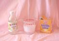
| 10/21/2003 07:47:18 PM |
Acid + Alkaline = CO2 + Yucky stuff!by DebN2003Comment: the pic looks a little soft - i can't tell if its the focus or the background. My suggestion would be to use a more contrasting darker color for the background to "bring out" the main subjects more. |
| 10/16/2003 06:38:28 PM |
No Makeupby TooCoolComment: Good take on the category. My only suggestion would be to use another angle to cut out the other houses in the neighborhood, they are a little distracting. Just a thought, nice idea. |
| Photographer found comment helpful. |
Home -
Challenges -
Community -
League -
Photos -
Cameras -
Lenses -
Learn -
Help -
Terms of Use -
Privacy -
Top ^
DPChallenge, and website content and design, Copyright © 2001-2025 Challenging Technologies, LLC.
All digital photo copyrights belong to the photographers and may not be used without permission.
Current Server Time: 04/13/2025 11:59:18 AM EDT.