| Image |
Comment |
| 07/21/2002 12:19:00 PM |
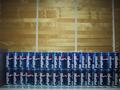
Addicted to Pepsi?by snergurComment: OK, someone like Pepsi WAY too much. But beyond that, I find myself simply just thinking, "Ummmm, ok." Trying to figure out what this shot is supposed to convey and I'm just not getting it. About the only suggestion I can make is that you stack enough of the cans so that you could shoot an entire "wall" of them instead of just two rows -- the table and windowblind aren't doing anything for your presentation. |
| 07/21/2002 12:22:00 PM |
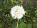
Blow me awayby freetimeComment: Could have been a great macro, but I think the reveresed focus really hurts here. a pretty dandelion seed head in focus against a blurry green would have been much more effective. I'd also try a "Rule of Thirds" composition instead of the perfectly centered. |
| 07/21/2002 06:47:00 PM |
Boaby bobgaitherComment: Nice snap of a couple of girls holding the boa. Wish you could have done a macro on its skin. Or maybe even a close-up that showed some snake and some of one of their hair and neck. However, since they're not looking at the camera, I'm guessing they don't nkow you and this was just an opportune time to shoot. The background is so light -- you did a good job keeping them out of the shadows. They look a little soft on the focus, but nothing that I could feel justified in ranting to you about. :-) |
| 07/21/2002 07:05:00 PM |
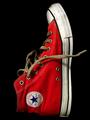
'Phallic' by Daniel Towseyby clayComment: I dig the picture -- not so keen on the title, I have to admit. This looks a little pixellated and not quite as sharply in focus as maybe it could be. Love the color of the shoelace and the way the one appears to be suspended in the air. |
| 07/21/2002 06:27:00 PM |
Ice Cream in Phoenixby BNCComment: I think I would have asked whoever was holding the cone to try getting a little lower to the ground and shot to use the grass for all of the background. Right now, I feel like there are things I want to see in the background and the ice cream is just in the way. It looks like you got the focus right as far as the cone goes, but the ice cream is so soft and runny, it's a little deceptive. I love the drip, but I wish I could see someone trying to eat this faster than it's melting -- maybe still losing, but at least trying. |
| 07/21/2002 07:11:00 PM |
Fun With Paperby GraciousComment: Beautiful colors. I think you have the basis for a great idea here. I'd suggest using a really smooth paper (maybe origami paper?) and take some real care to fold the fans perfectly. Then make sure it's well lit to avoid as much of the camera "grain" as possible from being introduced to the picture. |
| 07/21/2002 04:32:00 PM |
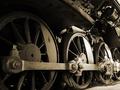
Steam Powerby jmsetzlerComment: Love the lines and the lighting on this one. The tint is a good choice -- makes me think of expressions like the golden age. The focus is defintely on the wheels and the driving arm, without totally separating it from the rest of the train. Nice and sharp. If I had to pick a flaw, it would be those little white specs in the LL. *grin* I'm just teasing. |
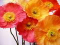
| 07/21/2002 04:18:00 PM |
Poppiesby JeanComment: I'm not sure if I think the shallower depth of field worked with this one or not. Partially, I think that may be because I'm not sure, visually, which is actually the dominant flower int he grouping and since some of the portions I'm drawn to are out of focus.... Love the color combination and the touch of white space in LL corner. I think the OOF stems also bug me a little bit. All in all though, one of my fav images this go round. |
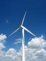
| 07/21/2002 11:51:00 AM |
The power of wind !by zacowacoComment: Centering the subject gives it a real feel of strenght. Love the blues. Nice bit of motion blur -- wish maybe a bit more -- but hard in that kind of bright light. The clouds do a good job of grounding the subject. Good work. |
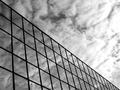
| 07/21/2002 11:57:00 AM |
Half & Halfby chariotComment: Great use of B&W -- beautiful range of tones. I'm gonna be really picky -- maybe a slightly less cloudy day to give a little more sky to reflect and to break up the clouds a bit. Also, Is that a bird or something on the building in the lower right? I know it's dumb, but that little bit of whatever sticking out detracts from the overall symmetry of the piece for me. |
Home -
Challenges -
Community -
League -
Photos -
Cameras -
Lenses -
Learn -
Help -
Terms of Use -
Privacy -
Top ^
DPChallenge, and website content and design, Copyright © 2001-2025 Challenging Technologies, LLC.
All digital photo copyrights belong to the photographers and may not be used without permission.
Current Server Time: 04/11/2025 04:41:33 PM EDT.