| Image |
Comment |
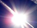
| 10/23/2002 07:34:00 AM |
Oct. Sunby DianaComment: I'm one of those who feels this doesn't fit the challenge since the _only_ light I see in this pic is the sun, and that' not artificial in my book. Sorry. |
 Photographer found comment helpful. Photographer found comment helpful. |
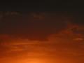
| 10/22/2002 08:00:00 AM |
Setting Sunby BitzComment: Nice subject choice, with a gorgeous, very complimentary background. I'm not sure if the shadows from the tree (?) outside help or hinder. The outer, dark margins to the right and left seem unnecessary to me. I think I would have consider shooting this as a vertical (or cropping to that). Nevertheless, a very nice shot. |
| Photographer found comment helpful. |
| 10/23/2002 07:32:00 AM |
My Handby hannComment: OK, I'm a big fan of abstract, but I think this one is pushing it even for me. Apart from the very little bit of color in the lower right, this might as well be "Two White Cows in a Snowstorm." I can't offer any suggestions, since there's not really anything there but the white. Sorry. |
| 07/21/2002 06:22:00 PM |
Sunsetby sohrComment: Nice framing of the sun. I think you might have been able to crop this it 427 instead of 480 and lost some of the information along the bottom of the pic. The water and sihlouette are good, don't get me wrong, I just think maybe you don't need quite so much of them. In fact, I wonder what the sky looks like above what's in the current picture. Maybe you could have composed this so the horizon was 1/3 of the way up from the bottom instead? |
| 07/21/2002 12:21:00 PM |
Night Skyby burlapComment: OK, good attempt at an abstract, but I think I want to see a little more focus in this before I'm willing to accept it. As mean as it may sound, this almsot looks like an accidental shot that you just decided to enter. The only thing that makes me thing otherwise is the way the color shift is pretty evenly horizontal. |
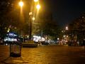
| 07/21/2002 06:20:00 PM |
The Urban Chemist's Playgroundby dequinixComment: First, I don't really understand the title -- part of me wonders if this is where a bomb has gone off. If so, this picture may means something to the people in the area but it doesn't seem like there's anything in the shot to identify it to outsiders. I'd like to see something play a more dominant role in the photogrpah regardless. The lamps are cool -- and I think you might be able to do something cool with the trashcan. |
| 07/21/2002 06:24:00 PM |
Summer Grooveby DSekkesComment: Kind of an interesting look. Extremely pixellated/compressed -- you have about 15 times more space that you could have saved the file at. I'd also suggest a vertical composition instead of a horizontal to focus on the main subject of the frame and cut out all the really dark portions at left and right. |
| 07/21/2002 06:44:00 PM |
dreamboatsby queen 91Comment: I feel like you either needed to shift the camera up and capture more of the masts, or down and capture more of the reflection, or move/zoom back to do both. As it now stands, I'm just not finding anything int his photo to really engage my attention -- apart from wondering if I can read the name on any of the boats and sense Tenacity is the only one I can see, that wodnering didn't last too long. You might even consider shooting this as a vertical to emphasize the tall nature of the masts -- even if it means sacrificing some of the boats that wouldn't make it in the shot. |
| 07/21/2002 12:03:00 PM |
Liberty Island Sunsetby chakkobboComment: Great silhouette with a nice sunset. Like hte fact that you can see the flag in the shot too. I wonder how this would look if it was cropped a little closer. It might lose some of the feeling of freedom which it now has, but it feels almost like there's a bit too much sky. Just an idea. |
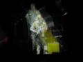
| 07/21/2002 07:00:00 PM |
fingers and toesby MrsKroComment: LOL -- "It's too grainy!" Yup, it is and I LIKE IT! Really interesting effect -- looks like the photo was really blown out and then brought back somehow. What did you use under the feet? |
Home -
Challenges -
Community -
League -
Photos -
Cameras -
Lenses -
Learn -
Help -
Terms of Use -
Privacy -
Top ^
DPChallenge, and website content and design, Copyright © 2001-2025 Challenging Technologies, LLC.
All digital photo copyrights belong to the photographers and may not be used without permission.
Current Server Time: 04/11/2025 04:41:31 PM EDT.