| Image |
Comment |
| 02/05/2006 12:55:35 PM |
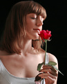
English Roseby AlexSaberiComment: The lighting is well done. I think I would have preferred to see the model's eyes at least partially open. |
 Photographer found comment helpful. Photographer found comment helpful. |
| 02/05/2006 12:54:34 PM |
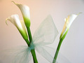
Always the Bridesmaidby Joy MooreComment: The reddish tone of the background in the top right and the faint vertical lines on the wall are rather distracting. If the backdrop were more uniformly red the white of the flowers would stand out a lot more. As it is the flowers don't stand out too much; using a shallower DoF or misting them with water would help to make them feel more three-dimensional. |
| 02/05/2006 12:50:59 PM |
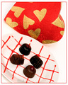
Sweets For My Sweetby idnicComment: The plate and background are a little over-exposed, and the chocolates are rather under-exposed. More diffused lighting (or even using a long exposure and painting this with light) would have helped to balance the light distribution. |
| Photographer found comment helpful. |
| 02/05/2006 12:49:09 PM |
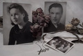
Grow old along with me, the best is yet to be...for my Parents.by willagherComment: I'd have liked this better if the man's picture hadn't been so obscured by the dried flowers. The lighting is rather flat; increasing the contrast would help this image to have a little more punch. Maybe it's just due to the style of the old portraits, but somehow this shot seems a lot more emotionally sterile than anything entered in a Romance challenge should be. The look on the woman's face looks more like sad determination (to stick with the relationship?) than heated passion. |
| 02/05/2006 12:44:22 PM |
Just Loveby doctabrezComment: I'm not sure whether this is a wide-angle shot or if that's just an illusion due to the concentric canopy, but I find that the effect interferes with my enjoyment of the image. Using a shallower DoF would have helped to reduce the impact of the wide angle. The people seem a little more posed than I'd like; I think that a more relaxed shot of them focusing on each other rather than the camera would have been more interesting. |
| Photographer found comment helpful. |
| 02/05/2006 12:41:32 PM |
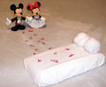
Follow the Path of Rosesby lilkarebearComment: If you had shot this using real people I'd have rated it much higher. As it stands, this just seems cheesy. Oddly enough, this is more clothing than I've seen either Mickey or Minnie wear before. |
| 02/05/2006 12:39:58 PM |
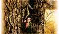
Castle's vine veinsby agenkinComment: The window is a little over-exposed. Adjusting the curves a bit might allow you to salvage some detail from the high end. This image has no obvious connection to the challenge topic, and your title seems to make no effort to establish such a link. |
| Photographer found comment helpful. |
| 02/05/2006 12:36:55 PM |
I love herby anaperaltaComment: The soft focus almost seems intentional, but because the neck of the girl on the right is in fairly sharp focus the softness throughout the rest of the image feels a bit amateurish rather than creative. The heavy makeup on the one model contrasts sharply with the lack thereof on the other girl. Since the bright red lipstick is the most prominent feature of the image, it would have been nice to have the focus centered there. |
| Photographer found comment helpful. |
| 02/05/2006 12:28:50 PM |
Romance what is left of itby aznaturalComment: This photo would be a lot easier to appreciate if it were larger. The fact that the color fades to white on only the vertical edges is distracting. |
| 02/05/2006 12:27:06 PM |
Romance is dyingby neehaiComment: The odd blurry filter is distracting. Your title is the only link to the challenge topic. |
Home -
Challenges -
Community -
League -
Photos -
Cameras -
Lenses -
Learn -
Help -
Terms of Use -
Privacy -
Top ^
DPChallenge, and website content and design, Copyright © 2001-2025 Challenging Technologies, LLC.
All digital photo copyrights belong to the photographers and may not be used without permission.
Current Server Time: 04/07/2025 06:15:52 AM EDT.