| Image |
Comment |
| 01/15/2006 02:00:50 PM |
Our Colorful Ranchby ShannonLeeComment: Sunsets are beautiful, but they're so common that a picture of one has to be done well before it's interesting. Nothing in this image appears to be in good focus, but the focus doesn't appear to be intentionally soft. The white fence in the bottom of the image is distracting. |
| 01/15/2006 01:57:20 PM |
red on pinkby jan5500Comment: The lighting here is too flat; since the subjects are so close in color increasing the contrast between them in some other way is essential. |
 Photographer found comment helpful. Photographer found comment helpful. |
| 01/15/2006 01:55:39 PM |
Little Natby ShelleyComment: I like the contrast in the B&W portion of the image, but the selective desaturation seems to have been done because it was possible rather than because it improved the image. |
| Photographer found comment helpful. |
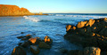
| 01/15/2006 01:55:35 PM |
Lone Pineby John WhiteComment: I can't find the pine. The colors seem over-saturated, and the scene lacks a clear subject. Recomposing the image to focus on either the rock formations or the wave would have improved the image. It's hard to tell with such a wide-angle shot, but this appears to have been oversharpened a bit. |
| 01/15/2006 01:55:30 PM |
Make your ownby Pug-HComment: The lighting here is rather flat; more directional lighting from the side would have helped to add a lot of depth. |
| Photographer found comment helpful. |
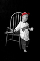
| 01/15/2006 01:55:23 PM |
Kid's Colorby nowlinComment: The lighting here is rather flat; more directional lighting from the side would have helped to add a lot of depth. |
| 01/15/2006 01:54:14 PM |
pizzazz by ursulaComment: I think that we have a winner. I really like the DoF, and the vibrant colors are very well done. The only things that might improve the image would be to change the light green blur in the lower right quadrant (by shifting the hue or desaturating it) and possibly adding a stronger reflection on the glass to add to the depth. This image is clearly worthy of being sold as stock at one of the higher-end agencies like Alamy. |
| Photographer found comment helpful. |
| 01/15/2006 01:41:56 PM |
layers of blueby hopperComment: This looks oversharpened. A hair light placed directly behind the flower would give it a nice glow around the edges. The wilted-looking (desaturated?) leaves on the flower contrast with the petals in a way that feels imbalanced rather than complementary. The stem appears to be framed slightly off-center; I would like it better if the flower were angled to place the stem 1/3rd of the way toward either edge or moving it to the exact center. |
| Photographer found comment helpful. |
| 01/15/2006 01:35:54 PM |
Vinegar Mosaicby jrjrComment: The highlights on the backdrop stand out a little more than they should, and the bottle isn't in very sharp focus. If the contrast in the background were lower or the focus on the bottle were sharper this would be a better image. |
| Photographer found comment helpful. |
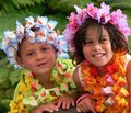
| 01/15/2006 01:33:48 PM |
Holiday Funby kari1Comment: This feels like a snapshot - too staged to be candid, but too quickly composed to look like a portrait. If both of the kids were either looking at the camera or engrossed with something offscreen then the presentation would seem more relaxed. Cropping off half of the girl's shoulder makes the image feel a little cramped. A catchlight in the subject's eyes would have been a nice touch. |
| Photographer found comment helpful. |
Home -
Challenges -
Community -
League -
Photos -
Cameras -
Lenses -
Learn -
Help -
Terms of Use -
Privacy -
Top ^
DPChallenge, and website content and design, Copyright © 2001-2025 Challenging Technologies, LLC.
All digital photo copyrights belong to the photographers and may not be used without permission.
Current Server Time: 04/12/2025 11:28:27 AM EDT.