| Image |
Comment |
| 02/16/2003 12:36:13 AM |
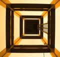
Don't Look Up!by JakComment: Strong lines lead the eye up--one almost feels vertigo!--good colours -strong graphics this is symetrical without being boring using the staircase as a counterpoint |
 Photographer found comment helpful. Photographer found comment helpful. |
| 02/16/2003 12:34:28 AM |
|
| 01/16/2003 06:54:13 PM |
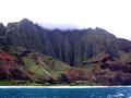
Kauaiby WarpComment: Very dr5amatic--well exposed |
| 01/16/2003 06:53:12 PM |
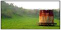
Forgottenby spidermanComment: Well composed and balanced-the curve of the horizon almost kissing the water tank-good colours--well done |
| 01/16/2003 06:47:45 PM |
Kansas Hayby moodvilleComment: Excellent composition--the eye keeps coming back to the hay and the horizon |
| Photographer found comment helpful. |
| 01/16/2003 10:55:49 AM |
|
| Photographer found comment helpful. |
| 01/16/2003 10:42:18 AM |
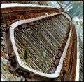
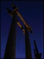
san jacintoby moondoggieComment: The Critique Club
This photo has a wonderful feel to it ГўЂ“the towering verticals contrasting with the sky lead the eye to the caps on top in a lighter warm shade. There is an air of mystery about itГўЂ”there is nothing simple about this image and everyone will interpret it differently. I feel a sort of primal religious dominance ГўЂ“it really is very effective. I notice people took issue with you about the darkness of the photo. I think that it may be too dark but then again the very darkness adds to the mystery and make this a hard photo to interpret. Perhaps if the blue was lightened this might have increased the contrast between the black and the sky and made the image easier to read. The shading of the blue is wonderful (and I think I see distant mountains at the bottom) and that richness must not be sacrificed if you lighten the image. Your composition is good and conveys all the grandeur of the monument.
A wonderful image that should have done better
Andrew
|
| 01/14/2003 08:31:22 AM |
Smile A Little Smile For Meby SteveZComment: The Critique Club
The overwhelming feeling I get from this photo is the joy of life- this is a great character at any age and your photo has brought this out. The smile is wonderful and the lack of teeth merely an eccentricity. The cap looks glued on and I am sure he never ventures anywhere without it ГўЂ“I am also sure he is the life and soul of the neighbourhood-well doneГўЂ”it is very difficult to capture personality in a portrait we are all so concerned about the lighting and the pose that we forget the basics!
Your photo does seem to be a bit out of focus but I see from your specs that you shot this at a slow speed and maybe he moved slightly when you released the shutter. The background is nicely out of focus so that it doesnГўЂ™t distract. The exposure is spot on and I donГўЂ™t think that I would worry about the shadow over the eyes. There is a huge amount of detail in that shadowГўЂ”everything is visible ГўЂ“possibly if you had a reflector it might have lightened that shadow. The eyes are slightly out of focus but their colour shines through.
Altogether I think this is a stunning portraitГўЂ”there are small problems with focus but these problems are overwhelmed by the personality of the portraitГўЂ”well done
Andrewm
|
| 01/11/2003 10:35:01 AM |
TAHITI BOUND!by MustbelostComment: The Critique Club
Your photo for the Travel competition is well composed, well exposed and there are no digital problems. It is also about travel and so fits into the challenge well. The only problem I can see is that your subject is very mundane and there is nothing to jolt the viewerГўЂ”to make him thinkГўЂ”hey I never saw this from this angle-I never thought about this in this particular way. I am sure in most cities around the world there are examples of signage and buildings that come close to this ГўЂ“so this picture is probably very familiar to most people in some way or another. And I think that this is why you scored fairly lowГўЂ”the picture did not hold the viewers interest. Perhaps if you had taken this from a different angle it might have been more strikingГўЂ”
Andrew
|
| Photographer found comment helpful. |
| 01/11/2003 10:18:15 AM |
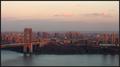
Sunset on The City: A 30th Floor Viewby RiderGalComment: The Critique Club
When I first saw your photo I felt immediately that this cityscape was composed of such warm colours that all the harshness of the normal urban landscape is brushed away and the human scale seems to come back. Your composition is good with the bridge leading the eye into the city which stretches as far as the eye can see. The water makes a good base for the warmth of the cityscape. Te focus is good with a wealth of detail that I am sure will come up on a good printГўЂ”there are no digital artefacts and your exposure seems spot on with detail in the shadows and a warm glow from the clouds in the sky.
As you can see from the comments most people enjoy the picture postcard feel to your photo and indeed I am sure that the quality is there. The only criticism that I can make is that there are no surprises in your photoГўЂ”I know this is difficult but the picture seems to cry out for an aeroplane or a boatГўЂ”but this is nitpickingГўЂ”Well done on a lovely urban landscape
Andrew
|
| Photographer found comment helpful. |
Home -
Challenges -
Community -
League -
Photos -
Cameras -
Lenses -
Learn -
Help -
Terms of Use -
Privacy -
Top ^
DPChallenge, and website content and design, Copyright © 2001-2025 Challenging Technologies, LLC.
All digital photo copyrights belong to the photographers and may not be used without permission.
Current Server Time: 04/09/2025 04:59:05 AM EDT.