| Image |
Comment |
| 11/18/2005 09:43:13 PM |
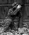
Camouflage shotby philupComment: It would be interesting to see what it would look like with the photographer on the ground to better the concelment. The viewers eyes loook directly at the hands because it's not camoflauged and you noticed that there is a camera in hand. Pretty good concept and would be neat to see more outtakes based on this. |
 Photographer found comment helpful. Photographer found comment helpful. |
| 11/18/2005 09:43:50 AM |
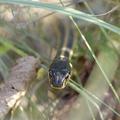
Count to ten & I'll hide .....by ralphComment: Great depth of field. The body seems to blend right into the background with the technique. Good focusing on the head brings your eyes toward the subject. This makes for a successful shot. |
| 11/18/2005 09:41:00 AM |
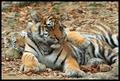
Babies Blending Inby sajinComment: The 2nd tiger almost blends into the ground like it is purposely hiding. Always wonder if a tiger can actually hide with their prominently stripes but looks like they can with prove being here. |
| Photographer found comment helpful. |
| 10/10/2005 05:28:49 PM |
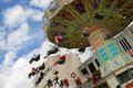
State Fair Swingsby L1Comment: Interesting angle taken. I feel dizzy already. Usually you see the people swinging toward the viewer, but you went the other route and made it look like the viewer is on the ride. |
| Photographer found comment helpful. |
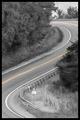
| 08/12/2005 11:20:49 PM |
Nasty Bendby kjenningsComment: Composition is nice with the selective desat of the yellow. Makes you want to race up around the curve on a motorcycle or sportscar. Simply a drifters' dream image.
The darkness of the black frame makes the image itself seem like it need a bit more contrast. A slight darking of the contrast in levels would make the image and the frame blend together nicely. |
| Photographer found comment helpful. |
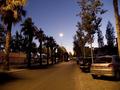
| 08/09/2005 10:43:50 PM |
Western Life Styleby vascComment: The lines of the street leads the eyes toward the center of the image. The lineup of trees also bring the viewers eyes to this point. This causes the viewer to focus at that area where the road ends. Putting your main subject here would make it a good composition. |
| Photographer found comment helpful. |
| 04/26/2005 08:05:03 PM |
|
| Photographer found comment helpful. |
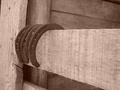
| 03/20/2005 08:27:21 PM |
Leave your shoes at the door.JPGby Rachel34Comment: A bit more contrast would make the image pop. Composition is fine. Realigning the tilt of the vertical wood would give a better feeling, but you're definitely on the right track with this one. Also a bit of sharpening would give some textural interest. |
| 03/13/2005 07:19:01 PM |
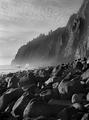
Pacific Vistaby ZoomdakComment: Sorry, only gave you a 10. I thought this was going to be a ribbon winner. |
| Photographer found comment helpful. |
| 01/19/2005 12:38:09 PM |
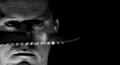
American Psychoby rmtm333Comment: Seems like most slick, sharp (no pun intended) images get higher scores. Interesting that the knifes shadow seems to make the eyebrow longer and the face more menacing.
I can see the concept improved with more sharpness and see it as a movie type poster. |
| Photographer found comment helpful. |
Home -
Challenges -
Community -
League -
Photos -
Cameras -
Lenses -
Learn -
Help -
Terms of Use -
Privacy -
Top ^
DPChallenge, and website content and design, Copyright © 2001-2025 Challenging Technologies, LLC.
All digital photo copyrights belong to the photographers and may not be used without permission.
Current Server Time: 04/07/2025 06:23:27 AM EDT.