| Image |
Comment |
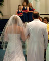
| 05/12/2009 01:27:02 PM |
IMG_0009.jpgby malenurse1979Comment by Mark-A: Weddings are not my thing really as I tend to shoot more model portraits / headshots / glamour stuff, but I do know that I really like this image, even the noise doesn't detract from the moment that you have captured beautifully, I am sure any bride would be happy to have this shot in their book.
Hope I have helped in some way or another, feel free to PM me if you want to discuss any of the C/C I have given. |
 Photographer found comment helpful. Photographer found comment helpful. |
| 05/12/2009 01:22:07 PM |
Halley 1by malenurse1979Comment by Mark-A: I quite like the concept here, again IMHO it's the cropping that falls a little short, the girl looks a little lost and so the image loses some impact, for a change the arm crop and foot crop doesn't overly bother me ;) and I think that's because the tilt is quite dynamic and her strong look at the camera works well (might have been nice to have a small amount of white in the corner of the eye but that might have lost the intensity in the look).
Here's a crop I think works a bit better.
 |
| 05/12/2009 01:15:09 PM |
_MG_0044_edit8x10a.jpgby malenurse1979Comment by Mark-A: Much better than previous one as SaraR says, I still have a problem with regards cropping / framing, for me a golden rule is never crop out at joints, fingers, feet (so ankles would be bad as far as I'm concerned), her right arm does look a bit in limbo so that could be something to look at also again a little tight at the top. I am not bothered by people cropping into heads unlike some, but it needs to be done properly, either crop in tight or leave room above (in most cases).
As always a little positive vibe :) Love the setting, awesome DOF and quite nicely lit. |
| 05/12/2009 01:08:30 PM |
_MG_0030_edit8x12.jpgby malenurse1979Comment by Mark-A: As per your post a little C/C:
I think the cropping is the main problem with this shot, both hands really need to be completely in the shot and you could crop tighter to the left, if I'm completely honest I feel it's a bit tight at the top too as it's a portrait rather than a glamour / headshot style shot.
I like the bokeh in the background but when I shoot portraits I try and avoid dissecting the head with hard lines such as the chair back (although it's not a killer issue in this shot I do still think it detracts a bit).
On a positive side the model seems very relaxed and the black and red work well together in her outfit / accessories. |
| 05/12/2009 01:03:23 PM |
_MG_0358.jpgby malenurse1979Comment by SaraR: I would have placed the violinist on the right hand third rather than centrally. otherwise a pleasing portrait. |
| 05/12/2009 01:02:15 PM |
_MG_0370-Edit.jpgby malenurse1979Comment by SaraR: I can see that this would appeal to the client - it captures guests, bridesmaids, bride and father, all without being cluttered. as with some of the other photos it does seem a tad noisy for a professional wedding photo. |
| 05/12/2009 12:59:29 PM |
|
| Photographer found comment helpful. |
| 05/12/2009 12:58:25 PM |
|
| Photographer found comment helpful. |
| 05/12/2009 12:55:42 PM |
_MG_0044_edit8x10a.jpgby malenurse1979Comment by SaraR: I much prefer this one to that of the girl sitting on the bench. The blacks have detail throughout and the skin tones seem better. the pose and composition are also more pleasing, although it does look rather like she doesn't know quite what to do with her hand that is reaching out of the frame! I am quite sure that she would be pleased with this portrait. |
| 05/12/2009 12:52:44 PM |
_MG_0030_edit8x12.jpgby malenurse1979Comment by SaraR: You asked for some critiques of your recent uploads, and advice on what you could do differently.
With this photo you have captured a pretty expression, and the girl is in a pleasing and natural pose. Unfortunately the way it has been framed feels a little haphazard; I perhaps would have preferred more of the arm in shot. The skin has gathered under her armpit, which isn't flattering - it may be that you can do a bit of cosmetic readjustment in photoshop, although it would probably be easier to avoid it altogether through different framing. The three other things that stand out to me are the noise, particularly on the arm nearest the bench back; a section of the hair has lost detail; and the white patch of bokeh that enters through one ear and passes out the other.
This all sounds very negative - it isn't meant as such. Take from it what is useful to you, and discard the rest! |
Home -
Challenges -
Community -
League -
Photos -
Cameras -
Lenses -
Learn -
Help -
Terms of Use -
Privacy -
Top ^
DPChallenge, and website content and design, Copyright © 2001-2025 Challenging Technologies, LLC.
All digital photo copyrights belong to the photographers and may not be used without permission.
Current Server Time: 04/07/2025 09:28:28 AM EDT.