| Image |
Comment |
| 10/08/2008 10:42:01 AM |
|
| 10/02/2008 06:07:20 PM |
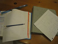
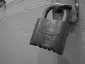
Safeboxby MikeManComment by MikeMan: Thanks a lot for the comments ;) I really appreciate it when people take time to help a beginner like me. Thanks for the encouragement! |
| 10/02/2008 06:04:06 PM |
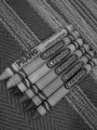
Crayons!by MikeManComment by MikeMan: Thanks for the tips! I will try to improve my contrast and resolution on my next B&W submission.
MJ |
| 09/26/2008 01:27:05 PM |
|
| 09/25/2008 05:22:12 AM |
Crayons!by MikeManComment by tpbremer: you could really use a contrast boost on this one... its comes off pretty muddy |
| 09/24/2008 06:04:46 PM |
Crayons!by MikeManComment by geinafets: The image seems a bit too gray. Upping the contrast to add more white and more black would make everything stand out better. Since most westerners read from the top left to the bottom right, the eye sees it as strange when text is angled the opposite way. |
| 09/24/2008 08:40:42 AM |
Crayons!by MikeManComment by stevieian: A simpler background, more clarity, and brand new (all) crayolas would've made this even stronger. BTW commenting only |
| 09/22/2008 08:56:40 AM |
|
| 09/22/2008 07:11:50 AM |
Safeboxby MikeManComment by houstonian: Does not really say "safety" to me. The angle on the picture is just not right. Also, maybe you should have gone a bit darker on the image. |
| 09/19/2008 05:45:46 PM |
|
Home -
Challenges -
Community -
League -
Photos -
Cameras -
Lenses -
Learn -
Help -
Terms of Use -
Privacy -
Top ^
DPChallenge, and website content and design, Copyright © 2001-2025 Challenging Technologies, LLC.
All digital photo copyrights belong to the photographers and may not be used without permission.
Current Server Time: 04/18/2025 02:49:30 PM EDT.