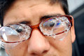
DPChallenge: A Digital Photography Contest You are not logged in. (log in or register
 
Browse Settings
Currently viewing:
Registered Userhesperia

Show comments:

Per page:

Order:

Comments:


Comments Received by hesperia
Pages:  
Showing 11 - 20 of ~42
Image Comment
Theres somthing on my glasses
02/07/2010 04:05:12 PM
Theres somthing on my glasses
by hesperia

Comment by snaffles:
Greetings from the Critique Club!

I think this is a very sweet photo. Glasses of course are quite fragile, as are bubbles, so a good combo of the two. The settings are fine for this shot.

However, dpc voters tend to dislike glare, and there really isn't much compostion. Image has a snapshot feel to it, which is why you have no comments (albeit a critique, now, and that you finished so low. Mind, you did get 3 10s.

I empathize because I can see what you wanted to do with this shot, and given the nature of the challenge that can be quite tough to do. My advice, as always: keep shooting. That really is the only way to improve. Second piece of advice: feel free to look at the early stuff I shot 3 years ago, when I first joined the site with a crappy little p&s. They'll not only make you feel better and hopefully encourage you to keep trying :-)

Feel free to PM me with any questions,

Susan
Photographer found comment helpful.
Main Street
02/02/2010 05:48:24 PM
Main Street
by hesperia

Comment by Yo_Spiff:
Clear and sharp, but it's not coming off to well other than that, I'm afraid. The extremely centered horizon doesn't help to lead my eye around the frame and there is not any particular element that says "look here".
Main Street
01/29/2010 12:39:47 PM
Main Street
by hesperia

Comment by MinsoPhoto:
For me I am not a fan, it just seems a bit bland with no real place to focus on.

*** adding that I think this would be better with a landscape orientation. You do have excellent focus, dof and colors though so I am increasing my original score.
Main Street
01/29/2010 07:19:04 AM
Main Street
by hesperia

Comment by liberty:
Nice colors, the sings on the left are bit distracting..5.
Photographer found comment helpful.
Main Street
01/28/2010 11:58:06 PM
Main Street
by hesperia

Comment by duartix:
I just can't decide but I just can't shake the feeling that the horizon got a bit tilted .
Main Street
01/27/2010 10:55:22 AM
Main Street
by hesperia

Comment by Luci11e:
I think this shot have used a different angle or a different crop - its the street signs on the left that bother me.
Photographer found comment helpful.
Main Street
01/27/2010 09:53:51 AM
Main Street
by hesperia

Comment by Nuzzer:
Too much sky puts the horizon in the centre of frame, more attention on the cracks in the road would be good
Photographer found comment helpful.
Main Street
01/27/2010 05:53:56 AM
Main Street
by hesperia

Comment by EL-ROI:
I think this photo is a bit too literal an interpretation of the challenge. You have the street shown and for composition it has some leading lines in it but it really doesn't lead you to anything.
troy
10/16/2009 09:51:39 AM
troy
by hesperia

Comment by fitz3000:
you need a little bit highter contrast
Photographer found comment helpful.
troy
10/15/2009 04:49:35 PM
troy
by hesperia

Comment by vexillologist:
good
Photographer found comment helpful.
Pages:  
Showing 11 - 20 of ~42


Home - Challenges - Community - League - Photos - Cameras - Lenses - Learn - Help - Terms of Use - Privacy - Top ^
DPChallenge, and website content and design, Copyright © 2001-2025 Challenging Technologies, LLC.
All digital photo copyrights belong to the photographers and may not be used without permission.
Current Server Time: 04/17/2025 10:55:54 PM EDT.