feed me, swing me by
murataxuComment by JacksonGariety: Greetings from the Critique Club!
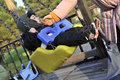
Before I start... Love the title, it just fits the image so well and gives you this feel that helps communicate your subjects perspective. The first major problem I see here is motion blur. The best way to avoid that in your lighting situation would to be to raise your ISO to 400 and your shutter speed up to 1/200 sec. That way you'll be able to capture your subject sharp as a tack. Next, we have that large pillow thing down in the corner (?), not exactly sure what it is but it detracts from the photo by setting the general balance of the photo off. This image in particular will probably look best with the two left-side edges of the photo empty. Mom fills the two on the right, the kid is your subject between mom and the left-side border, and then it would be nice not to have that tarp/balloon thing over there, and the wooden structure seems a little close to the corner for my taste. In general photography, when objects are that far away and really unneeded in the photo, the best composition will try not to put them in the corners, as it's the most prone spot to detract attention from the subject. The tilt really makes the photo interesting, in conjunction with the swinging kid, it's just priceless, and the expression on his face, it really just leaves you in the moment. Great idea, great title, near perfect composition, you just have some technical errors that could have been done differently and a lot of motion blur on the subject. The whole background is a little distracting to the photo the way you had it set up, so rather then shooting straight on, you could have tried shooting at an angle from above or below. And because of the way you took it, I would recommend cropping in from the bottom left a bit. One last thing, your lighting situation was a bit dull, no easy way to change that except in Post-processing. Truthfully, this should have gotten a higher score, probably somewhere around a 5 or 5.5, I just don't think most voters associated this with love, though it certainly is a very prominent form of it in our culture. Good job, just try shooting at a higher shutter speed in the future, and shooting at and angle that can compositionally situate your subject in the photo. Keep it up!
-
 ColemanGariety
The Critique Club