Timothy at Twilightby
tearose4Comment by karmat: CRITIQUE CLUB CRITIQUE
by karmat
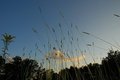
Compositionally, this shot has some nice elements, but there really isn't anything to "tie it together." I like the lower perspective and how we seem to be looking up at at the grass. This perspective adds interest to the shot. However, everything is so random, I find myself asking, "Why was this picture taken." It almost feels like you were taking a picture of something specific, and it exited the frame too quickly. Another thing that might make it feel more balanced would be to move to the right or left (if possible) and not have the tall trees in the background. Use negative space of the sky to balance the "grass strands."
Technically, I like that it is not a silhouette, and that there is some detail visible. Also, your fill flash is subtle enough to be effective. Sometimes, a fill flash can be harsh or look awkward, color wise. Focus seems okay, but there really isn't any detail present (it is all too small and too far away).
Overall, not a bad shot, but one that leaves the viewer feeling a bit amiss. Yes, it does capture the essence of the challenge, but it doesn't seem to have any purpose.
Karma