| Image |
Comment |
| 11/17/2003 10:12:39 PM |
A rose is a rose is a rose...by robert ellisonComment by amazoneea: Greetings from The Critique Club!
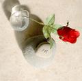
Nice picture to comment on. Pleasant subjects. Rose so frail, so ephemere and the stone, so hard, so eternal... I wish you used better that diagonal so it would direct my eyes up instead of down. A rotation of 90 degrees Left would have done miracles. I would be very happy if you will try it at least. You should pay more attention to the shadows. The refracted light by the bottle is distracting from the beauty of the whole. Harsh reflections or harsh shadows rarely add to a picture. You tried to enhance it in Photoshop I think but something happened there as the photo has so much noise. It is more visible on the rose and on the shadows of the stones. But, overall I think you did fine, it is only your third submission. You are getting better and better. Keep up the good work.
Best regards,
Elena |
| 11/11/2003 02:52:24 PM |
|
| 11/11/2003 12:36:33 PM |
A rose is a rose is a rose...by robert ellisonComment by PTLParsons: Something about the rose itself that makes me try to get shadow or light off so I can see better. The shadow of the stone is very distracting and the bright spot above the vase is also very distracting. In spite of these it is still a very good photo. |
| 11/11/2003 07:52:58 AM |
|
| 11/11/2003 02:52:21 AM |
|
| 11/09/2003 08:41:49 PM |
|
| 11/06/2003 10:29:51 AM |
|
| 11/05/2003 07:57:05 PM |
|
| 11/05/2003 07:32:02 PM |
|
| 11/05/2003 08:54:03 AM |
|
Home -
Challenges -
Community -
League -
Photos -
Cameras -
Lenses -
Learn -
Help -
Terms of Use -
Privacy -
Top ^
DPChallenge, and website content and design, Copyright © 2001-2025 Challenging Technologies, LLC.
All digital photo copyrights belong to the photographers and may not be used without permission.
Current Server Time: 04/09/2025 11:01:50 AM EDT.