| Image |
Comment |
| 08/28/2006 05:21:44 PM |
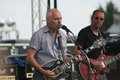
Peter Framptonby mecfcostaComment by Mick: Dang, Peter looks even older than I do! :D
Nice shot Maria. I wish I could have been there too. |
 Photographer found comment helpful. Photographer found comment helpful. |
| 07/27/2006 10:04:50 AM |
Self Portraitby mecfcostaComment by Canadian_eh: Nicely done! I think your soft focus works really well here! i personaly like a full mug shot rather than the teasers, but thats just me ;-) |
| Photographer found comment helpful. |
| 07/25/2006 12:07:32 PM |
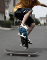
Freestyleby mecfcostaComment by Givemeashot: Really cool capture. I just the like the frozen in time of these kinds of shots. You get the foot work frozen...the arms and even the toung. (ha ha Ha lol) well done sht i like it. Colors are soft and not to distracting on what is actually going on here. |
| Photographer found comment helpful. |
| 07/08/2006 09:14:43 PM |
edit4.jpgby mecfcostaComment by Nikonian Ninja: I'm not a big fan of foot pics but I do like the shallow depth of field here and the b&w definitely makes it more interesting |
| Photographer found comment helpful. |
| 07/06/2006 10:28:43 AM |
|
| Photographer found comment helpful. |
| 07/06/2006 07:35:06 AM |
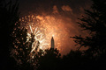
On Fireby mecfcostaComment by carisakD70: Too bad there was so much smoke...the building looks like it is watching...has little red eyes :) |
| Photographer found comment helpful. |
| 07/05/2006 08:47:35 PM |
|
| Photographer found comment helpful. |
| 06/28/2006 01:01:41 PM |
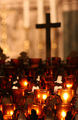
Praying cornerby mecfcostaComment by Givemeashot: This is really cool i like the lighting....DOF is great i like how you can still see the cross in the back ground and make it out. very soft feeling picture i like it good job |
| Photographer found comment helpful. |
| 06/25/2006 06:18:15 PM |
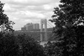
George Washington Bridgeby mecfcostaComment by LoudDog: Greetings from the critique club Maria,
I love the composition of this. In my book it�s a great example of framing but I think you may have suffered a little in the scoring because a lot of the voters look for a complete frame around the photo. I also really like the subject and the B&W. Image wise if there was one thing I would have done differently, I might have framed it a little more to the left so you have less tree on the right and the bridge pillar is in line with the rule of thirds.
Technically, I�d like to see the clouds pop a little more, although they are pretty vivid as is. A polarizer could help do this if you did not use one. I noticed you shot this at f16. I�ve got the same lens and find it�s sharpest at f8-f10. I think you could still get the DOF you want at f10 and you�d have a faster shutter (if you shot hand held) and would get a better image. Also, it may have been haze, but the bridge looks a little grey. Maybe some playing around in levels, curves or with the contrast could make this a little better (if you haven�t already tried). Too bad this wasn�t a member challenge because you could burn the area and make the haze go away.
All around, great job. I personally would have given it a 6, maybe a 7. There are a few minor issues but I don�t think the strong composition more then makes up for them. Good luck on future challenges, if you have any questions on this review feel free to contact me.
|
| Photographer found comment helpful. |
| 06/23/2006 03:23:18 PM |
edit3.jpgby mecfcostaComment by Tygerr: I like this photo. The only tweak I might make is to crop the ear off, although it's not a massive problem, because I do like the wide feel of the photo.
And then I have a slight concern about the lighting. That dark side of the face distracts me a bit. The eye feels a bit wrong - it's either "too there", or "not quite there enough"... Does that make sense? What I mean is, I'd prefer to have it a bit darker on that side, or have a bit more light definition - like classic Rembrandt lighting - with a triangle of light on the cheek, and have a slight glint in the eye.
But still, love the subtle colour and the striking pose. |
| Photographer found comment helpful. |
Home -
Challenges -
Community -
League -
Photos -
Cameras -
Lenses -
Learn -
Help -
Terms of Use -
Privacy -
Top ^
DPChallenge, and website content and design, Copyright © 2001-2025 Challenging Technologies, LLC.
All digital photo copyrights belong to the photographers and may not be used without permission.
Current Server Time: 04/07/2025 08:57:58 AM EDT.