| Image |
Comment |
| 01/12/2007 03:50:10 AM |
|
 Photographer found comment helpful. Photographer found comment helpful. |
| 01/12/2007 03:03:20 AM |
|
| Photographer found comment helpful. |
| 01/11/2007 07:17:41 PM |
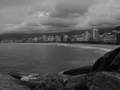
Arpoadorby mecfcostaComment by rblanton: Like the composition and clarity. It is fairly flat and needs some PS work to really make the potential of this shot work for it. |
| Photographer found comment helpful. |
| 10/15/2006 08:25:30 PM |
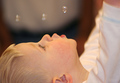
Bubblesby mecfcostaComment by Cheerz: Lovely..
and a very priceless capture..
try croping it into a square frame to increase the impact..
:) |
| Photographer found comment helpful. |
| 10/15/2006 08:20:51 PM |
|
| Photographer found comment helpful. |
| 10/12/2006 08:43:57 AM |
|
| Photographer found comment helpful. |
| 10/12/2006 08:43:12 AM |
|
| Photographer found comment helpful. |
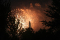
| 10/12/2006 08:42:29 AM |
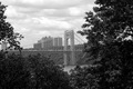
On Fireby mecfcostaComment by ArpeggioAngel: Like the use of the trees as a natural frame. The building is a nice addition although I wish it had a little more detail. |
| Photographer found comment helpful. |
| 09/01/2006 03:43:06 PM |
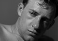
edit5.jpgby mecfcostaComment by jdannels: I really like the conversion to B&W and the lighting is really good. My one major critique would be the point of focus which is on the tip of the nose. I think it would be better if the focus was on the eyes to bring more attention to the his expression and make the viewer think about what he is thinking. hope this helps.
joe |
| Photographer found comment helpful. |
| 08/31/2006 04:24:30 PM |
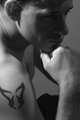
edit1.jpgby mecfcostaComment by BakerBug: Thank you for your donation to the Leukemia & Lymphoma Society
Great shot! The lighting in this photo is very dramatic! I really like how his face is in shadow, it adds a little suspense to the shot. This works quite well in B&W. I like the expression of his pose. It makes you wonder what he may be thinking about. You did a great job conveying "deep thoughts". The one thing I might have done differently is not crop it so tight. His tattoo and the top of he ear are right on the photo's edge. Adding just a little bit more room around those elements would allow the lines in this photo to be more natural.
Thanks again for your donation!!
|
| Photographer found comment helpful. |
Home -
Challenges -
Community -
League -
Photos -
Cameras -
Lenses -
Learn -
Help -
Terms of Use -
Privacy -
Top ^
DPChallenge, and website content and design, Copyright © 2001-2025 Challenging Technologies, LLC.
All digital photo copyrights belong to the photographers and may not be used without permission.
Current Server Time: 04/07/2025 08:57:57 AM EDT.