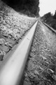
Keeping on trackby
chrisgoddardComment by ambaker: Critique Club Review:
Color Saturation and Hue: N/A (image is B&W)
Brightness and Contrast: The surface of the coin appears blown-out, and some of surface of the rail is also. However, this may be intentional for this image. Otherswise brightness and contrast are very good.
Focus and Depth of field. Focus seems a bit misplaced, depth of field feels a bit shallow. The rocks, spikes, and weeds are very sharp and well done. However, with the gentle curve of the surface of the track, and the lost highlights near the coin, the effect becomes that there is no portion of the track that is really in focus. The eye gets off the track to view the sharply defined objects and hesitates to complete the intended journey. The leading line, want to lead to the background, but it is soft. As is the foreground. Which leaves little for the eye to do.
I do like the angle of the image, and the overall idea. You have some good foundations here to build upon. I see that this is your first challenge entry. A very reasonable entry for a first timer. (Yes I do read the photographer's bio to try to get a sense of their style and where they are coming from.)
Hopefully you will keep going and enter again.