| Image |
Comment |
| 05/19/2005 02:27:51 PM |
Ginaby EddyGComment by theSaj: Good shot...
Possible ideas for improvement.
The grey chair back is very distracting. If you absolutely need the chair. Perhaps buy a large white napkin and cover it so it is less distracting.
Top of the head is cut off, not sure if this is pro/con.
Perhaps too much detail on the skin. You see the hair, freckles, etc. stand out too bluntly. (Many females are shy of such.)
Superb capture of the eyes!!!! And face/hair in general.
/= |
 Photographer found comment helpful. Photographer found comment helpful. |
| 05/19/2005 02:05:56 PM |
Ginaby EddyGComment by Art Roflmao: Great shot, Eddy! The lighting expression, sharp focus! Only thing I might say is the crop (or framing) is way tight for my liking. But excellent nonetheless. |
| Photographer found comment helpful. |
| 05/19/2005 01:54:38 PM |
|
| Photographer found comment helpful. |
| 05/02/2005 10:52:29 AM |
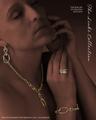
The Links Collectionby EddyGComment by graphicfunk: Hey Eddie: Outstanding use of techinque to bring forth this elegant lovely study. Great advertising because the image kept rising in my third eye. It is those images that one desires to show another person, like look, is this not grand?
Congratulations on your 7th finish. |
| Photographer found comment helpful. |
| 05/01/2005 08:16:35 PM |
The Links Collectionby EddyGComment by buzzrock: I missed this one when voting,--
Dial-Up!
Well done Eddy, this a great photo, with excellent light, I woulda gave it a 10 |
| Photographer found comment helpful. |
| 05/01/2005 04:00:56 PM |
|
| Photographer found comment helpful. |
| 05/01/2005 01:47:55 PM |
|
| Photographer found comment helpful. |
| 05/01/2005 10:38:18 AM |
|
| Photographer found comment helpful. |
| 05/01/2005 07:25:46 AM |
The Links Collectionby EddyGComment by NathanWert: I'm torn here....At one point I like the way she's all dark, but at another I don't like it. I just can't make up my mind. However, I love the way it augments the brighter jewelry. |
| Photographer found comment helpful. |
| 04/30/2005 05:46:03 PM |
The Links Collectionby EddyGComment by GeneralE: Good job bringing out the jewelry, and the type works too -- though I usually make it a little bolder if it's reversed type for use in a print ad, as that can sometimes plug up on the press and become less-readable. |
| Photographer found comment helpful. |
Home -
Challenges -
Community -
League -
Photos -
Cameras -
Lenses -
Learn -
Help -
Terms of Use -
Privacy -
Top ^
DPChallenge, and website content and design, Copyright © 2001-2025 Challenging Technologies, LLC.
All digital photo copyrights belong to the photographers and may not be used without permission.
Current Server Time: 04/07/2025 08:53:49 AM EDT.