| Image |
Comment |
| 07/03/2009 05:31:19 PM |
|
| 07/01/2009 09:40:59 AM |
|
| 07/01/2009 07:01:20 AM |
|
| 06/25/2009 07:00:46 AM |
|
| 06/26/2008 03:20:12 PM |
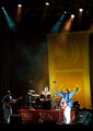
Brazilian Minister of Cultureby odradekComment by ambaker: Critique Club Review:
Color and saturation are good. Contrast and brightness are OK, but leave the white of the guitarists pants completely blown out. The scene is otherwise well lighted. However I think the vertical format works against this image. The smoke in mid frame and the lighting at the top of the frame, compete with the subject (which I believe to be the band). When I look at the image my eye keeps wandering to the top of the frame, and this may have held down your score. I find myself wanting to see more of the band, and see more detail there.
There is an out of focus shadow at the center, at the bottom of the stage. (Another person, a stray photographer's finger?)
Although not bad, the stage does tilt from left to right. A little rotation of the image and then cropping just enough to make the edges of the picture straight, will fix this.
If this picture had been cropped at the top of the lower orange panel in the background, and then made larger, it would have worked better for me. You used the rule of thirds to good effect top to bottom, but then centered the band left to right. I don't know what was to the left or right of the band for getting them off center. Perhaps this was the best that could be done.
|
| 06/20/2008 03:00:24 PM |
|
| 06/15/2008 07:16:57 AM |
|
| 06/11/2008 09:40:44 AM |
|
| 03/31/2008 04:23:06 AM |
|
| 03/30/2008 11:41:30 PM |
Road Limitsby odradekComment by wanjun: I almost didn't catch waht the "pattern" is at first. I like the colors in this, but I think you could've done a better job bringing out the colors and saturating them more. |
 Photographer found comment helpful. Photographer found comment helpful. |
Home -
Challenges -
Community -
League -
Photos -
Cameras -
Lenses -
Learn -
Help -
Terms of Use -
Privacy -
Top ^
DPChallenge, and website content and design, Copyright © 2001-2025 Challenging Technologies, LLC.
All digital photo copyrights belong to the photographers and may not be used without permission.
Current Server Time: 04/08/2025 10:52:46 PM EDT.