DPChallenge: A Digital Photography Contest You are not logged in. (log in or register
 
Browse Settings
Currently viewing:
Registered UserDiSc

Show comments:

Per page:

Order:

Comments:


Comments Received by DiSc
Pages:   ... ...
Showing 71 - 80 of ~208
Image Comment
// h o l i d a y //
01/16/2009 08:33:00 AM
// h o l i d a y //
by DiSc

Comment by Ja-9:
The greens look a little flat...curves/levels?
Photographer found comment helpful.
// h o l i d a y //
01/16/2009 05:11:52 AM
// h o l i d a y //
by DiSc

Comment by bassbone:
the brightness of the light, the paleness of the blues in the water and sky, the narrow horizontal crop on the scene, the lack of a specific subject to draw us in - it gives this image an unfinished feel
Photographer found comment helpful.
Good morning
01/15/2009 08:56:49 AM
Good morning
by DiSc

Comment by geinafets:
The shadow seems kinda distracting.
Photographer found comment helpful.
Good morning
01/15/2009 07:14:55 AM
Good morning
by DiSc

Comment by Peredur:
Not bad, but it would have been better to kill the shadows with a reflector (or substitute).
Photographer found comment helpful.
Good morning
01/14/2009 11:04:52 AM
Good morning
by DiSc

Comment by tiffanyleski:
I like this shot, and I really like the title too. That bright color would certainly cheer my morning.
Photographer found comment helpful.
Good morning
01/14/2009 04:16:20 AM
Good morning
by DiSc

Comment by shudson:
More a photo of food than of cooking.
Good morning
01/14/2009 01:15:05 AM
Good morning
by DiSc

Comment by aliqui:
Very nice idea. Yummy kiwi colors!

However, I don't think the harsh lighting is doing this photo much good. Your lights are throwing very dark shadows that are adding more of a distraction than interest. I would suggest diffusing your light sources to get softer edges on your shadows.
Photographer found comment helpful.
Sun
01/09/2009 08:38:46 PM
Sun
by DiSc

Comment by photokariangel:
This is Kari Ann, greetings from the Critique Club:

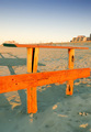
composition: this lacks somewhat in the composition, i see a little of a high horizon approach, but the fence seems to be too centered

color: the orange of the fence is very interesting, i thought it was painted at first. it contrasts well with the blue sky

contrast: a little flat, could have used a boost to help emphasize the subject

focus:
focus is good, nice, sharp, and on the fence (correct subject)

depth of field:
this seems to be lacking as well, everything from the fence all the way back to the houses in the distance is in focus, not really separating the subject from the distracting background

lighting:
very unique lighting experience here, i quite like it.

other: in the end, this photo didnt have enough "WOW!" to take voters by suprise. Also, the confusing (for some) subject matter further pushed voters to give a lower score. I suggest trying out different angles, and different DOF's in order to separate this interesting fence piece, and give it that "Wow!"

I hope this helped you. If not, feel free to PM me, and i'll get in touch with you. Keep going in the challenges, practice makes perfect!
-Kari Ann
Low Tide Log
01/07/2009 04:03:27 PM
Low Tide Log
by DiSc

Comment by bauerfan71:
Very pretty. Well done.
Photographer found comment helpful.
Water
01/06/2009 03:28:46 PM
Water
by DiSc

Comment by poser:
nice
Pages:   ... ...
Showing 71 - 80 of ~208


Home - Challenges - Community - League - Photos - Cameras - Lenses - Learn - Help - Terms of Use - Privacy - Top ^
DPChallenge, and website content and design, Copyright © 2001-2025 Challenging Technologies, LLC.
All digital photo copyrights belong to the photographers and may not be used without permission.
Current Server Time: 04/07/2025 09:35:22 AM EDT.