| Image |
Comment |
| 06/01/2008 07:51:27 PM |
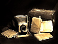
My Grandfather's Cameraby mhlambiComment by karmat: CRITIQUE CLUB CRITIQUE
by karmat
Compositionally, I think this is a well done shot. The different elements, in addition to the camera, helps to add balance and interest. I think a lower perspective may have been a bit more dramatic, but it is still well done. Also, a tighter crop may have made it feel a bit less "standard" or less like a camera ad and more like "art." (If that does not make sense, let me know and I will try to articulate it better).
Technically, I like how you made it look and feel old. The processing of the picture really compliments the subject nicely.
Overall, an interesting shot, and it does obviously meet the challenge.
Best to you in future challenges. |
| 05/25/2008 07:48:56 PM |
|
 Photographer found comment helpful. Photographer found comment helpful. |
| 05/25/2008 06:11:37 PM |
|
| Photographer found comment helpful. |
| 05/24/2008 11:41:58 AM |
Studiousby mhlambiComment by bvy: Nice effect, but the dapple doesn't add much to the image. Looks a little too posed also. |
| 05/23/2008 08:12:06 PM |
Studiousby mhlambiComment by Drummond: Beautiful smile. Nice lighting. I want to be on the other end of that web chat. Great picture. |
| Photographer found comment helpful. |
| 05/23/2008 06:17:27 PM |
Studiousby mhlambiComment by dponlyme: pretty model but she looks a little too posed to look candid if that was what you were going for. It just looks like it would be uncomfortable. The foreground is well exposed but there is no detail at all in the shadows. Still not bad. Looks like something you would see in a brochure for a college. |
| Photographer found comment helpful. |
| 05/23/2008 06:18:26 AM |
|
| 05/23/2008 05:40:18 AM |
Studiousby mhlambiComment by Kwilson10: i like the ring of light around the subject. and the lighting on the face is really good as well. i just dont like the background too much |
| Photographer found comment helpful. |
| 05/21/2008 05:11:37 PM |
Studiousby mhlambiComment by Dirt_Diver: You have some very good lighting there and subject matter is good and clean. Only nit pick I have is the BG side walk. It's not too bad but kind of distracting. |
| Photographer found comment helpful. |
| 05/21/2008 03:55:30 PM |
|
Home -
Challenges -
Community -
League -
Photos -
Cameras -
Lenses -
Learn -
Help -
Terms of Use -
Privacy -
Top ^
DPChallenge, and website content and design, Copyright © 2001-2025 Challenging Technologies, LLC.
All digital photo copyrights belong to the photographers and may not be used without permission.
Current Server Time: 04/05/2025 05:38:25 AM EDT.