| Image |
Comment |
| 03/12/2008 02:30:28 AM |
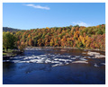
The Stackby MAKamykComment by UrfaK: I almost want to see more of the tower's neck but it's fine the way it is.. like the tilt of the smoke.. |
| 11/06/2007 10:21:33 AM |
|
| 11/02/2007 07:27:55 AM |
|
| 10/26/2007 12:31:31 PM |
|
| 10/05/2007 09:08:46 AM |
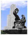
A Song to Nature. by MAKamykComment by Moatz: This is a really cool statue. I would say I would like to see it with only sky in the background (instead of the building), but then you wouldnt be have the same perspective on the statue. |
| 10/03/2007 05:47:17 PM |
|
| 10/01/2007 04:48:40 PM |
A Song to Nature. by MAKamykComment by HeiSch: nice idea of the partial desaturation. in this case I can't help but finding it unnatural. But that's just me, probably. The big areas of color conflict with the lig areas of bright grey. Technically a solid picture. |
| 10/01/2007 08:43:22 AM |
A Song to Nature. by MAKamykComment by alanfreed: I know the area quite well since I used to work right next door there... I can't say I'm fond of the selective desaturation here. I'm just not getting the point of editing it that way. |
| 10/01/2007 06:46:26 AM |
|
| 10/01/2007 05:36:22 AM |
A Song to Nature. by MAKamykComment by Budya: I like the details of the statue, especially all the curves and the lines. I am not too hot about the building -- it seems a bit tilted to the right and lacking contrast. |
Home -
Challenges -
Community -
League -
Photos -
Cameras -
Lenses -
Learn -
Help -
Terms of Use -
Privacy -
Top ^
DPChallenge, and website content and design, Copyright © 2001-2025 Challenging Technologies, LLC.
All digital photo copyrights belong to the photographers and may not be used without permission.
Current Server Time: 04/07/2025 11:48:53 AM EDT.