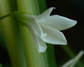
DPChallenge: A Digital Photography Contest You are not logged in. (log in or register
 
Browse Settings
Currently viewing:
Registered Userdcb300

Show comments:

Per page:

Order:

Comments:


Comments Received by dcb300
Pages:   ... ...
Showing 131 - 140 of ~236
Image Comment
A PLace of Worship on a foggy Sunday morning
05/31/2007 08:07:29 PM
Photographer found comment helpful.
A PLace of Worship on a foggy Sunday morning
05/30/2007 08:32:09 PM
A PLace of Worship on a foggy Sunday morning
by dcb300

Comment by lazyb_daslacker:
foggy nice shot i give it a 7 good capture
Photographer found comment helpful.
Castle-like County jail
05/30/2007 05:08:14 PM
Castle-like County jail
by dcb300

Comment by JLC:
What a wonderful old building!
Castle-like County jail
05/30/2007 12:24:24 PM
Castle-like County jail
by dcb300

Comment by Artifacts:
Positives:
Color and lighting are the strengths of this composition.

Technicals:
Color, lighting and perspective is good in this image. Cropping to include the tree framing adds viewer interest.

Looking on a sharpness sensitive monitor it appears just a touch oversharpened. You can see some digital "jaggies" along the some of the edges on the stairwell.

You might consider a closer crop to highlight the building more. The overhang just to the immediate right bottom of the building acts as a distraction.

The Challenge:
You scored 4.9 which is about .4 below the challenge average. Voters probably felt the link to the challenge topic was weak and lowered the score because of it. Oversharpening may have contributed to a lower score as well.

Suggestions:
The best change you could make to this for a higher score is to crop it differently and closer to the near wall of the building. By cropping it closer to include only the near wall would better direct viewer attention to the 'shapes' it has which is, after all, what attracted you to the image in the first place. Be sure to crop out everything to the immediate right of the main building wall.

Of course, that would mean cropping out almost all the nice tree framing on the left side which I'd normally recommend doing but it would be better for a "shapes" challenge.

Consider backing off the sharpness a bit to eliminate the "jaggies".

Note:
Your pictures are getting better. You are headed in the right direction. Keep with it and you can be as good or better than anyone else at this site.
The big fire in the sky
05/30/2007 10:26:55 AM
The big fire in the sky
by dcb300

Comment by littlefish:
I like. Sun is in correct placement for composition.
this tree has eyes
05/29/2007 02:12:02 PM
this tree has eyes
by dcb300

Comment by Artifacts:
Positives:
Overall the lighting is not bad and the BW is OK.

Technicals:
The toughest thing about selective desaturation is getting the color right and the boundaries between color and black and white right. That is not easy.

You had trouble on both counts. Your greens stand out like a sore thumb even though they are good in and of themselves. They just don't fit the desat. You allowed boundary colors in places it should not have been allowed and that is a cardinal sin in selective desaturation. On the other hand, in some places the boundaries are very good.

The Challenge:
Yes, it meets the challenge. But many voters will ask themselves why you picked the desat the way you did. Their conclusion will be that you did it just for the challenge and will fault the image for it and give you a low score.

Selective desaturation, more than any other technique, must be applied to invoke a strong emotional response. Yours does not do that. Voters will ask themselves why you made that choice and when they can't figure that out will vote it low.

A question you always want to ask yourself is this, will my submission stand on its own long after the challenge topic is forgotten. If the answer is no then don't submit it.

I have to make this admission. I scored this image a 2 because I felt the selective desat was not well done, did not fit the composition at all good and was just a poor choice for composition and desat.

Suggestions:
I could make a few technical suggestions for improvement but my bottom line is that it just is not the right image to submit for selective desaturation or for composition. Sorry.
Castle-like County jail
05/29/2007 11:18:42 AM
Castle-like County jail
by dcb300

Comment by quiche:
Interesting building, but for a challenge on shapes, it might work better to focus on a single shape instead of so many (the parapet, the stairs, the gridded windows, the trees, the folding chairs, etc.)
Photographer found comment helpful.
Castle-like County jail
05/29/2007 07:05:55 AM
Castle-like County jail
by dcb300

Comment by Blackstarlight0:
interesting colors
Photographer found comment helpful.
silky white flower
05/25/2007 11:33:32 AM
silky white flower
by dcb300

Comment by Artifacts:
Positives:
This is your highest score for an image submitted in a DPC challenge and you should be pleased with it. You captured a nice floral and its technicals are generally good.

Technicals:
This is "silky smooth" because the noise reduction you applied contributed to it and you did not overdo it. Sharpness is fine and not overdone. It is easy to oversharpen images. I know, I do it all the time. LOL!!!

The image is on the low contrast side. It looks a bit flat. Composition is OK but not spectacular. Overall lighting is decent. It does not have overexposed or underexposed areas like we often see in much higher scoring images.

The Challenge:
It meets the challenge though some voters will fault any and all flora images regardless of quality. That is a thought that should be kept in the back of your mind every time when deciding what to photograph should you want a higher score. Not saying not to do it, just saying to keep it in mind. Well done floral images will generally score well despite the prejudice as we see all the time in challenges.

You placed 59/140 so was viewed by DPCers as slightly above average for the challenge. That is not a bad thing.

Suggestions:
Looking at it now I can see a couple other things you might consider for improvement.

If you apply a simple "Auto Contrast" adjustment to this image in post processing it will improve brightness and contrast immediately and give this image more impact.

More advanced concepts such as vignetting and dodge and burn could be used to add more viewer interest to the composition and direct viewers to the areas of the composition where you want them to pay attention.

You might consider a tighter crop on the left, top, and bottom to remove more of the stem of the flower. It would give the flower more image real estate and remove some of the less interesting detail.
bird nesting.jpg
05/24/2007 11:11:03 PM
bird nesting.jpg
by dcb300

Comment by howzitboy:
adjust either levels or curves to get more contrast in the picture. looks a touch grainy so maybe a blur layer?
Pages:   ... ...
Showing 131 - 140 of ~236


Home - Challenges - Community - League - Photos - Cameras - Lenses - Learn - Help - Terms of Use - Privacy - Top ^
DPChallenge, and website content and design, Copyright © 2001-2025 Challenging Technologies, LLC.
All digital photo copyrights belong to the photographers and may not be used without permission.
Current Server Time: 04/08/2025 12:50:58 AM EDT.