| Image |
Comment |
| 06/12/2007 06:24:04 PM |
|
| 06/10/2007 07:36:15 PM |
|
| 06/09/2007 01:15:06 PM |
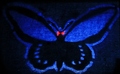
The Mothman Propheciesby DarkzedComment by HBunch: not sure what this is, and it's hard to tell that it was painted with light. I think maybe there could be a more interesting crop or way of displaying this. upper left corner is dark, causing a distraction. nothing to really hold my interest for long. crop is too tight around the subject and subject is too centered. overall lacking in the 'wow' department. |
| 06/09/2007 11:36:03 AM |
|
| 06/06/2007 10:49:58 PM |
|
| 06/05/2007 05:45:36 PM |
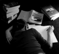
To much...by DarkzedComment by liberty: Nice black and white, would have been even greater if the stack of books wern't there, they distract a little, but nice image otherwise. 6 |
| 06/04/2007 07:15:17 AM |
To much...by DarkzedComment by nlghttrain: to me this shot is boring to look at, al though to composition is decent, the lighting needs some work, for me the darks in this shot get too dark, and there are hot spots on the books from where the light source is hitting it. |
| 06/01/2007 10:38:19 AM |
|
 Photographer found comment helpful. Photographer found comment helpful. |
| 06/01/2007 03:02:12 AM |
|
| Photographer found comment helpful. |
| 05/30/2007 12:20:22 PM |
To much...by DarkzedComment by cliff_wright: I'm not too sure I see the connection to the challenge theme and the subject looks like her left arm is broken to me which is very distracting ... |
Home -
Challenges -
Community -
League -
Photos -
Cameras -
Lenses -
Learn -
Help -
Terms of Use -
Privacy -
Top ^
DPChallenge, and website content and design, Copyright © 2001-2025 Challenging Technologies, LLC.
All digital photo copyrights belong to the photographers and may not be used without permission.
Current Server Time: 04/07/2025 06:55:32 AM EDT.