| Image |
Comment |
| 06/16/2003 03:20:48 PM |
|
 Photographer found comment helpful. Photographer found comment helpful. |
| 06/16/2003 02:19:13 PM |
Italian bathroomby GalinaComment by justine: Fantastic composition.....I love it. The only nit pic is that the light isn't more drastic or dramatic...........still this is my top three!!!!!! Beautiful work. |
| Photographer found comment helpful. |
| 06/16/2003 10:51:54 AM |
Italian bathroomby GalinaComment by Pidd: Very romantic. It looks as if it could be from another century. I like the lighting and your choice of keeping it in the tan tones. Much more effective than had you gone black and white or kept it in color. I like the feeling of softness it evokes. |
| Photographer found comment helpful. |
| 06/16/2003 09:24:44 AM |
|
| Photographer found comment helpful. |
| 06/16/2003 03:59:10 AM |
Italian bathroomby GalinaComment by Mitonski: Nice shot, good lighting. I know her body is off-centre, but it just doesn't feel off-centred to me - my problem I know, just picky I guess - a little less of a tight crop on the left would look good IMO. |
| Photographer found comment helpful. |
| 06/02/2003 04:31:10 AM |
|
| 06/01/2003 07:02:17 PM |
Russian Standardby GalinaComment by qachyk: Mmm. Vodka. As everyone knows, vodka is best experienced when frozen, making your colour choice absolutely perfect as it is reminiscent of ice. I am not sure if it would have worked better against a dark background or not -- the bottle does stand out, if not as much as I would have thought. I think a little less blue-tone shadow/refaction on the left center edge would have made it stand out better as well. |
| Photographer found comment helpful. |
| 05/29/2003 10:50:14 AM |
|
| Photographer found comment helpful. |
| 05/27/2003 08:02:23 PM |
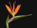
Bird of Paradiseby GalinaComment by HBunch: *Critique Club*
Oh wow. I dont think I've ever seen one of these before. I've definately heard of them, but I guess I've just never came across one. Very pretty.
Definately fits the challenge well. Got all 3 colors in one shot. The colors stand out really nicely on the black background as well. Nothing distracting in the background. Nice and simple.
The angle and framing/cropping are good. I like how this sneaks in from the top, and leads your eyes all the way to the point on the end.
My only suggestion would be to have the entire photo in focus. most of it is already in focus, which leaves the small tiny part that is out of focus to be a bit of a distraction. I'd like to see that tip nice and sharp.
Lighting is good. Brings out the colors nicely. Good focus on the part that is in focus. You show us some really nice detail here, and I like that very much.
~Heather~ |
| Photographer found comment helpful. |
| 05/27/2003 08:34:38 AM |
|
| Photographer found comment helpful. |
Home -
Challenges -
Community -
League -
Photos -
Cameras -
Lenses -
Learn -
Help -
Terms of Use -
Privacy -
Top ^
DPChallenge, and website content and design, Copyright © 2001-2025 Challenging Technologies, LLC.
All digital photo copyrights belong to the photographers and may not be used without permission.
Current Server Time: 04/12/2025 10:09:47 AM EDT.