| Image |
Comment |
| 05/08/2002 07:04:00 AM |
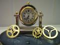
Wheels of Timeby janfriesComment by Patella: the clock face seems a little dark, perhaps using some white card stock or something to bounce some light into it would lighten it up without creating a glare. I'm not certain what the two "columns" are on the background. If they can't be removed, I'd consider moving your main elements so those strips are more centered on the rest of the image. You might also try the 10 to 2 or 10 past 10 settings for the clock hands (traditional advertising positions) -- that way they're not all bunched up in the same basic spot. |
 Photographer found comment helpful. Photographer found comment helpful. |
| 05/08/2002 03:38:00 AM |
Wheels of Timeby janfriesComment by magnetic9999: oo, nice clock! would have blasted this with more light, right on the face of the clock. use a desk lamp or something with directional lighting. |
| Photographer found comment helpful. |
| 05/07/2002 08:23:00 AM |
|
| 05/07/2002 06:49:00 AM |
|
| 05/06/2002 06:29:00 PM |
|
| 05/06/2002 02:58:00 PM |
|
| 05/06/2002 01:52:00 PM |
|
| 05/06/2002 10:52:00 AM |
Wheels of Timeby janfriesComment by eddy: This doesnt exactly sell me into the product. Its like a car add with the engine taken apart. |
| 05/06/2002 09:47:00 AM |
|
| 05/06/2002 09:40:00 AM |
|
Home -
Challenges -
Community -
League -
Photos -
Cameras -
Lenses -
Learn -
Help -
Terms of Use -
Privacy -
Top ^
DPChallenge, and website content and design, Copyright © 2001-2025 Challenging Technologies, LLC.
All digital photo copyrights belong to the photographers and may not be used without permission.
Current Server Time: 04/16/2025 12:06:27 PM EDT.