|
|
| Image |
Comment |
| 04/21/2010 12:01:33 AM | |
| 04/12/2010 09:30:25 PM | |
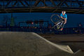
| 04/12/2010 08:02:08 PM | transfer out of the tubby chrispComment by Senay: Greetings from the Critique Club!
The lighting is great, however I do agree with the comment that the background is a distracting. I like the bridge part but the fence and cars, although I guess there isn't really anything that can be done about that.
You mentioned the slight blur on the helmet, but honestly it's very minor and most people might not have noticed.
Not really sure what you could do to improve this, you stopped the motion wonderfully. By looking at your votes received you can see most of the votes you got were 6 and fell off from there. You had a good picture but just not enough to get the extremely high votes.
If you have any questions click here to message me!
Senay |  Photographer found comment helpful. Photographer found comment helpful. |
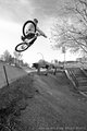
| 04/12/2010 05:49:31 AM | _DSC4645.jpgby chrispComment by Timosaby: I have to disagree with alohadave on the crop from the bottom because as the photo stands right now, including the ground gives a sense of height and elevation. In my opinion theres more room for processing improvement. I would darken the clouds and grounda little which would help guide the eye towards the boy whos conveniently placed infront of a bright background. |
| 04/09/2010 06:10:25 PM | _DSC4645.jpgby chrispComment by alohadave: I would crop out the dirt at the bottom of the frame. It's a lot of empty space that doesn't add anything to the picture, maybe just below the barrier on the left, or even a square crop.
That way, he fills the open space of the sky, and the tree and railing/barrier frames him well.
The B&W processing is fine, you have good texture in the tree, and strong lines and shapes that work well in B&W. | | Photographer found comment helpful. |
| 04/09/2010 05:49:49 PM | _DSC4645.jpgby chrispComment by Louis: In response to this thread, the composition on this is really well done, very dramatic. Great capture. I'm not sure what you could have done to improve it, though I actually might have tried the daunting task of removing that tree on the right, and the road sign below it. I've done pretty radical element elimination like that in photos before, and whereas it isn't easy, the result, if done well, is to dramatically improve the composition of a photo like this, because those elements seriously detract from the full impact of the scene -- in my view. Other photographers might like it as an anchoring balance, but for me, it's all about the guy on the bike. The lamppost should definitely go. Aside from that, it seems the biker wants to be more in the upper left corner of the frame, or at least somewhat higher in frame. Cropping from top and left may have helped.
As for the black and white processing, it is what it is: nice and clean with a good tonal range and nothing too crazy. I might have gone for something more dramatic, with black tones really pumped, maybe getting something more out of the clouds behind his head. Vignette for this would be a plus in my opinion. Slightly burning the areas surrounding the biker -- very restrained so that it isn't noticeable as burning -- would have added drama too. Message edited by author 2010-04-09 21:51:41. | | Photographer found comment helpful. |
| 04/06/2010 04:22:55 PM | |
| 04/05/2010 05:34:31 AM | | | Photographer found comment helpful. |
| 04/04/2010 06:33:25 PM | | | Photographer found comment helpful. |
| 04/03/2010 10:47:11 PM | |
Home -
Challenges -
Community -
League -
Photos -
Cameras -
Lenses -
Learn -
Help -
Terms of Use -
Privacy -
Top ^
DPChallenge, and website content and design, Copyright © 2001-2025 Challenging Technologies, LLC.
All digital photo copyrights belong to the photographers and may not be used without permission.
Current Server Time: 04/07/2025 09:11:58 AM EDT.
|