Why ?by
sandeep_tataComment by Dr.Confuser: Greetings from the Critique Club: I have been assigned your photo to critique and here are my thoughts:
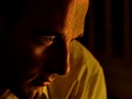
Personal Reaction: My initial reaction to your photo was very positive. Good looking model. Thoughtful pose. Very good photo.
Composition: Composition is excellent. It really brings attention to the eye, and then to the rest of the face. The shoulder in the background diminishes this a bit. I am sure it is an optical illusion, but the shoulder looks folded forward unnaturally, almost like it is someone else�s shoulder. A bit distracting.
Technicals: Lighting is excellent. Good DoF although blurring the shoulder a bit more might have helped, either with shallower DoF or with Gaussian blur. Color is interesting. There is a bit of a color cast. I am wondering if it would be better with a conversion to B&W. And if possibly subsequent conversion to Sepia would have strengthened it. A third possibility would be to use a Hue/Saturation layer and take out a little bit of yellow. I don�t have the original to play with but you might try that.
Conclusions: Excellent image. It�s publication or advertising worthy and deserved a higher score than it received in my opinion. Color cast and shoulder treatment probably cost you 1-2 points in voting. You are pretty new to DPC. I hope you will remain an active participant. I like you style and would like to see more of it.
As always, this is my personal opinion. Feel free to PM me if you�d like further dialog.