| Image |
Comment |
| 04/30/2003 01:10:37 PM |
Sand,Sea & Coconut Treesby KingLokComment by Gracious: Greetings from the Critique Club!
The colors here in your picture are beautiful and inviting. Looking at it makes me want to be there.
The architecture is very pretty and adds to the picture. Another great addition is the people. They give a sense of scale to the image.
The way the one palms comes in on a diagonal leads the eye deep into the scene. Nice! As others have mentioned, I agree that you should include the top of the Palms.
I think this is a good representation of flora.
Overall nice job!
Regards,
Grayce |
| 04/30/2003 10:31:39 AM |
Blue Bicycleby KingLokComment by GreggeN: I think you've overdone the colour effects a bit here - I don't think people will be keen on this shot. |
 Photographer found comment helpful. Photographer found comment helpful. |
| 04/30/2003 07:59:42 AM |
Blue Bicycleby KingLokComment by jaam: Not sure of the technique you have used here, but looks like a neg art or solarise that you have adjusted saturation/hue. Like the effect, but think it is a pitty about all the lost detail on the bikes and in the white area. |
| Photographer found comment helpful. |
| 04/30/2003 07:44:07 AM |
Blue Bicycleby KingLokComment by dsidwell: The blue in the sign and the bike connect the two very well. I'm not sure why that's important, though... |
| Photographer found comment helpful. |
| 04/30/2003 03:09:17 AM |
|
| Photographer found comment helpful. |
| 04/29/2003 07:45:01 PM |
|
| Photographer found comment helpful. |
| 04/29/2003 06:27:47 PM |
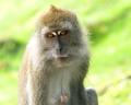
Monkeyby KingLokComment by Anachronite: good selective dof... turning down brightness and or bumping the contrast might help a bit as well with the exposure |
| Photographer found comment helpful. |
| 04/29/2003 09:55:21 AM |
|
| Photographer found comment helpful. |
| 04/28/2003 04:41:28 PM |
Monkeyby KingLokComment by inspzil: The expression has won me over. The background was disenchanting me until I saw her eyes. This is a very humbling, poignant photograph that is very strong with subject but the background is a little bright. You'll have to take a 7 |
| Photographer found comment helpful. |
| 04/28/2003 04:28:29 PM |
Monkeyby KingLokComment by GinaRothfels: Good shot.
I find the background a bit too bright. Decreasing the saturation of the yellows would take care of this. It would also take a bit of colour out of the monkey's eyes though. Still that is my preference. Others may disagree. |
| Photographer found comment helpful. |
Home -
Challenges -
Community -
League -
Photos -
Cameras -
Lenses -
Learn -
Help -
Terms of Use -
Privacy -
Top ^
DPChallenge, and website content and design, Copyright © 2001-2025 Challenging Technologies, LLC.
All digital photo copyrights belong to the photographers and may not be used without permission.
Current Server Time: 04/09/2025 01:07:03 PM EDT.