| Image |
Comment |
| 05/18/2003 12:16:23 PM |
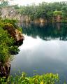
Abandoned quarry on a resort island.by KingLokComment by jmsetzler: Greetings from the Critique Club :)
Hi KingLok...
This is a nice scene and the composition is good as well... I'm not sure about the 'postcard' value of this photo overall... I'm not familiar with the area in which this was taken and what I see here doesn't seem to have a great tourist and visitor element to it, but I'm sure it's there in some way. The title leads me to believe that the 'resort island' has some postcard value that may be stronger than this particular scene...
The exposure on this shot is slightly off I think... the top portion of the scene seems to be slightly over exposed...
John Setzler
|
| 05/13/2003 09:54:44 AM |
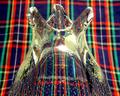
Vaseby KingLokComment by Dustin: i think this picture could be better if the pattern wasnt behind it. |
| 05/13/2003 09:53:08 AM |
Vaseby KingLokComment by Amiee: Nice image. I like how the plaid looks behind the glass. This makes the image very interesting. Good job. |
| 05/12/2003 08:29:39 AM |
Vaseby KingLokComment by RoxyBabe: I like this picture because it brings the background through the glass and makes it look really cool.
|
| 05/11/2003 04:37:46 PM |
Vaseby KingLokComment by DennisF: Nice piece of glass. I think a different background material would have worked better. |
 Photographer found comment helpful. Photographer found comment helpful. |
| 05/11/2003 02:03:11 PM |
Vaseby KingLokComment by MattW: i like the glass, but i think the background is distracting |
| Photographer found comment helpful. |
| 05/11/2003 03:53:35 AM |
Vaseby KingLokComment by inspzil: That's a mighty busy background. I see the refraction in the glass, but I'd have chosen something a little sublter in pattern. The vase is a very unusual piece. For some reason It reminds me of a rooster. |
| Photographer found comment helpful. |
| 05/09/2003 10:24:11 PM |
|
| 05/08/2003 04:28:36 PM |
Vaseby KingLokComment by cpanaioti: I like the look of the plaid through the glass and the perspective chosen for this image. the Plaid as a background is very distracting. This shot might have worked better in macro mode since it would be easier to really blur the background. |
| Photographer found comment helpful. |
| 05/08/2003 12:56:29 PM |
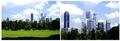
Financial Districtby KingLokComment by Paige: Critique Club
By Paige
Hi there.
You have a couple of strong shots that work well on their own, but as a story for this assigment they don't seem to work as well. Perhaps a shot of a man in a suit or a close-up of one of the buildings, to show a walking to work type of story.
I really like the composition and the coloring on the first image, the sky, grass, clouds and shadow work well together with the buildings.
The frame is lacking, it would have been a bit better to have a thin black line around each image to seperate the clouds from the border. It seems a bit thin to me too. Also there is more room on the left then on the right.
Overall nice images, you obviously have an eye for compositions, just work on the presentation and you've got a higher score. |
Home -
Challenges -
Community -
League -
Photos -
Cameras -
Lenses -
Learn -
Help -
Terms of Use -
Privacy -
Top ^
DPChallenge, and website content and design, Copyright © 2001-2025 Challenging Technologies, LLC.
All digital photo copyrights belong to the photographers and may not be used without permission.
Current Server Time: 04/06/2025 11:26:06 PM EDT.