Electric Skyby
sparklyComment by Azrifel: I saw in the forum that you only had one comment so far, so I was thinking: let me go and explain my score= 4, because the average was also sub-5 (I am not going to change it)
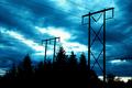
The 4 was greatly influenced by the "not very interesting"-factor. Electricity poles and lines, a bit of foliage profile, a colored sky and a very bright spot. Don't get me wrong, I see the relation of the color of the sky and the powerlines resulting in the idea "Electric Sky" and I think it was good idea. It is just that it doesn't look very interesting to me. The photo is a subject an sich, the main subject in the photo is not very clear.
The sky looks like as if the color was changed to these blue tones. It doesn't look natural. The contrast between the bright spot and the dark foliage is also very big, to the point where the brightness gets annoying. Also because the bright spot is in the middle. Somehow I also get the feeling that the poles lean backwards, especially the one on the left side.
I do like the off-centre positioning of the poles, the profile of the foliage and how the lines lead trough the frame. But this photo is on my personal voting range for this challenge just not good enough. In a normal challenge it might have been between 5 and 6 depending on the subject of the challenge.
Good luck in 2005. ;)
Here I am again. Checked your porfolio. Take "Taste Wheat" for example. I would have given that one an 8.