| Image |
Comment |
| 03/30/2003 12:11:18 PM |
What's your favorite dish?by vjozComment by karmat: CRITIQUE CLUB CRITIQUE
by karmat
Rough when you can't think of anything, isn't it? I've been there. When that happens, sometimes I take my camera out and just start shooting pictures and let whatever may happen. Othertimes, I will find a nice online gallery adn surf through it for a while.
About this picture:
COMPOSITION
I like the strong vertical "movement" of the dishes. You ahve a nice pattern set up here, and I think that it could potentially make this an awesome shot. Perhaps if the front dishes were evenly spaces, adn set a stringent "rhythm" then the back dish set like it is, almost as if it were "marching to a different drummer" it would have more immediate impact. They look a little too random, right now, I think.
TECHNIQUE
I like the hint of colors showing, and the front dishes being out of focus doesn't bother me too much. I do think that if perhaps there were some behind the focused one, and they were out of focus as well, it would make for a stronger visual image. Also, there is a strange shadow on the focused plate that looks like you may have adjusted either contrast or saturation a bit too much, and it looks a little like noise.
OVERALL EFFECT
I think this is a potentially good shot, it just lacks some of the "organization" things that would give it "grabbing" power. I do not mean to say that all shots must look straight or organized, but sometiems it helps to "control" the chaos.
Best to you in future challenges.
karmat |
 Photographer found comment helpful. Photographer found comment helpful. |
| 03/19/2003 02:44:27 AM |
What's your favorite dish?by vjozComment by Annida: We know which is your favorite dish! I think this would work better without the other out of focus dishes in the way. nice colours in the focused one! |
| Photographer found comment helpful. |
| 03/18/2003 08:28:48 PM |
|
| Photographer found comment helpful. |
| 03/17/2003 06:17:16 AM |
|
| Photographer found comment helpful. |
| 03/16/2003 10:41:58 PM |
|
| 03/16/2003 10:25:34 PM |
What's your favorite dish?by vjozComment by Silver Fox: Meets Challenge.
Visual Impacts not that great as the dish on the bottom is im focus but the ones in the middle and on top are out of focus.
Originality - good idea but lacked detail on the focus quality |
| Photographer found comment helpful. |
| 03/02/2003 05:41:26 AM |
Communicate hereby vjozComment by lisae: Cool! I miss those old phones. This would work very well as a stock photo, in my opinion, and it has a lot of kitsch charm. |
| Photographer found comment helpful. |
| 03/01/2003 06:26:13 AM |
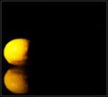
Lay low, Yellowby vjozComment by crabappl3: Critique Club Comment:
This is yellow. I don't feel moved by the shot though. The negative space although a good idea, is probably too much. Moving the lemon to the right some to add a little more balance on the left side would help equalize the framing. I think the horizontal placement is good. Your lighting is oversaturating the lemon. So much so that the details are lost. You may want to try bouncing the light off of a wall or ceiling, or diffusing it with a thing white paper or cloth. This will give you a more even lighting and allow more of the texture to show through. Your depth of field and post processing are both good.
I think that if you had more time to work on your lighting, the use of the mirror and the lemon could have created a wonderful shot, as it is, the lack of time available is evident. |
| Photographer found comment helpful. |
| 02/28/2003 06:10:55 AM |
Communicate hereby vjozComment by autool: They still got phones like that? An interesting shot but I keep asking myself, where would a person display a shot like yours? Who would buy it? I feel the market would be small but if a chain store wanted it you could make a bundle. 5 |
| Photographer found comment helpful. |
| 02/26/2003 06:38:05 AM |
Communicate hereby vjozComment by FranziskaLang: I can see this concept being used for stock photography, so you've met the challenge. It's fun to see one of those phones, my parents had one, now it looks old and clunky to me. I like the composition of your photo for stock photography, too. Generally, I would have said it's a little unbalanced, but in this case I feel there's room available for someone to add text to the photo. I do see some issues with the technical site of this photo. Overall, the focus is soft, and there are highlights from the lighting. That can be fixed by holding a couple of sheets of paper between the light-source and your subject. I can see your reflection in the middle of the dial, I'm not sure what would've been the easiest way of removing that. Lastly, your background is a little gray in the bottom right corner (I know just how hard it is to get a really white background so I appreciate your effort) and there are some dirtparticles (?) visible (right middle, inside of the loop made by the cord). |
| Photographer found comment helpful. |
Home -
Challenges -
Community -
League -
Photos -
Cameras -
Lenses -
Learn -
Help -
Terms of Use -
Privacy -
Top ^
DPChallenge, and website content and design, Copyright © 2001-2025 Challenging Technologies, LLC.
All digital photo copyrights belong to the photographers and may not be used without permission.
Current Server Time: 04/08/2025 12:38:19 AM EDT.