| Image |
Comment |
| 07/20/2006 05:49:51 PM |
|
 Photographer found comment helpful. Photographer found comment helpful. |
| 07/20/2006 11:31:27 AM |
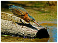
Green Heronby manishkComment by th3ph17: something about the coloring of this photo reminds me of old science textbooks from the 1960's. |
| Photographer found comment helpful. |
| 07/19/2006 09:08:18 PM |
|
| Photographer found comment helpful. |
| 07/19/2006 01:18:46 PM |
Green Heronby manishkComment by KarenNfld: Lovely capture, seems a bit oversharpened, the harsh sunlight on the log is distracting. A polarizing filter might have toned it down a bit. Still a great photo. |
| Photographer found comment helpful. |
| 07/19/2006 08:33:09 AM |
Green Heronby manishkComment by OdysseyF22: Great capture, the composition and placement of the heron in the frame bisects it nicely, and makes the eye want to travel to where the fish must be. 10 |
| Photographer found comment helpful. |
| 07/18/2006 11:41:58 PM |
|
| Photographer found comment helpful. |
| 07/17/2006 06:27:26 PM |
Ancient stationeryby manishkComment by graphicfunk: A little more attention with the lighting and this image would have finished much higher. However, the delivery of the image is great. Congratulations on your top 20 finish. |
| Photographer found comment helpful. |
| 07/12/2006 07:35:57 PM |
|
| Photographer found comment helpful. |
| 07/12/2006 07:26:30 AM |
Ancient stationeryby manishkComment by manishk: kteach: I fully agree with your observations. The finger does get lost in the paper. About the color: reducing the yellow was making the hand look like actual skin color and was not producing the ancient feel, but I agree that I need to learn sepia toning. This was my first attempt at making sepia.
lauralink: Yeah, it doesn't look ancient to me as well :) an older hand, and a better burning (not photoshop burning, but burning in oven) of the paper could have made it look ancient.
Commando303: You have it right.
Jutilda: I fully agree with you. It does need more negative space and a different angle.
once again, thanks every one for your excellent remarks. Message edited by author 2006-07-12 12:15:02. |
| 07/11/2006 03:23:54 PM |
4th July colorsby manishkComment by jerryc12: Very good shot. The audience in the foreground removes it from the mundane. I wish you had straightened the audience. (The tilt is disturbing. |
| Photographer found comment helpful. |
Home -
Challenges -
Community -
League -
Photos -
Cameras -
Lenses -
Learn -
Help -
Terms of Use -
Privacy -
Top ^
DPChallenge, and website content and design, Copyright © 2001-2025 Challenging Technologies, LLC.
All digital photo copyrights belong to the photographers and may not be used without permission.
Current Server Time: 04/07/2025 09:21:57 AM EDT.