| Image |
Comment |
| 05/02/2006 05:39:47 PM |
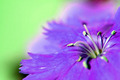
Crawling Outby DeeMizeComment by Elaine: Purple and green are not complementary colors. I would like to see the texture of the petals, and the blurry parts are distracting. |
| 05/02/2006 08:44:41 AM |
Crawling Outby DeeMizeComment by accord: I would suggest submitting a larger image--this looks nice but it's impossible to tell. |
| 05/01/2006 01:12:29 AM |
|
| 04/30/2006 05:31:10 PM |
|
| 04/30/2006 02:53:34 PM |
|
| 04/30/2006 09:36:57 AM |
|
| 04/30/2006 08:53:30 AM |
Crawling Outby DeeMizeComment by ElGordo: The depth of focus is entirely too shallow and is distracting. Try using a smaller aperture. As an alternative, move back from the subject to increase DOF and then crop in post process. A few may be put off by the non complementary colors, but they are passable. |
| 04/30/2006 07:20:37 AM |
|
| 04/30/2006 07:09:46 AM |
Crawling Outby DeeMizeComment by rwouthuis: This image has a number of items that I think keep it from scoring well. The image size is small, making it difficult to rate, the dominant colours are putple and green, which are not complementary based on colour theory and the overall DOF/focus (this last one may not be a factor but the size makes it look like the image is OOF). JMO |
| 04/29/2006 05:02:13 PM |
|
Home -
Challenges -
Community -
League -
Photos -
Cameras -
Lenses -
Learn -
Help -
Terms of Use -
Privacy -
Top ^
DPChallenge, and website content and design, Copyright © 2001-2025 Challenging Technologies, LLC.
All digital photo copyrights belong to the photographers and may not be used without permission.
Current Server Time: 04/08/2025 08:28:55 AM EDT.