| Image |
Comment |
| 07/22/2003 08:18:18 PM |
|
| 05/07/2003 04:23:09 PM |
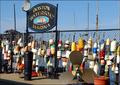
Bostonby svitalComment by frisca: I think I would have liked a little bit of text to make this feel more postcardy, but I applaud your subject choice and composition, its very unique! |
| 05/07/2003 09:17:46 AM |
Bostonby svitalComment by K-Rob: Very coloful. Could use a nice border. The satelite dish looks out of place but it's not too abvious. - 8 |
| 05/07/2003 06:59:12 AM |
Bostonby svitalComment by pinback: Colourful shot. Shame about the satellite dish, though. Not much you could do about it. Might have worked better if the sign had been shot head on, if possible. |
| 05/06/2003 06:20:21 PM |
Bostonby svitalComment by robbieh: I like how you incorporated the sign into the postcard... no need to add text. Nice colors and composition. |
| 05/06/2003 08:35:22 AM |
|
| 05/06/2003 07:09:17 AM |
Bostonby svitalComment by kiwiness: This is a very lively pic, lots of color. It was a good idea to take a photo with a sign already in it so it wasn't necessary to add text to it. Some pics in this challenge have been killed by the text they added. |
| 05/06/2003 06:44:19 AM |
|
| 05/05/2003 04:32:10 PM |
Bostonby svitalComment by KarenB: a fellow bostonian? nice shot, and cool idea for the postcard. |
| 05/04/2003 08:44:16 PM |
|
Home -
Challenges -
Community -
League -
Photos -
Cameras -
Lenses -
Learn -
Help -
Terms of Use -
Privacy -
Top ^
DPChallenge, and website content and design, Copyright © 2001-2025 Challenging Technologies, LLC.
All digital photo copyrights belong to the photographers and may not be used without permission.
Current Server Time: 04/07/2025 08:54:21 AM EDT.