| Image |
Comment |
| 04/24/2008 03:55:21 AM |
|
 Photographer found comment helpful. Photographer found comment helpful. |
| 04/23/2008 04:48:24 PM |
Odd Angleby jgriecoComment by tpbremer: I like this (I tend to like geometric abstracts). I'm wondering if you I would've liked it more w/o the bottom inch. I feel like that white block in the lower right hand corner sort of ends the pattern and without it, it may seem like it could really go forever in each direction, completely messing with the scale and giving the viewer no idea how large the building actually is. |
| Photographer found comment helpful. |
| 04/23/2008 11:34:20 AM |
|
| Photographer found comment helpful. |
| 04/21/2008 04:21:40 AM |
|
| Photographer found comment helpful. |
| 04/20/2008 11:00:10 PM |
|
| Photographer found comment helpful. |
| 04/20/2008 10:17:10 PM |
|
| Photographer found comment helpful. |
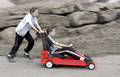
| 05/12/2007 02:37:22 PM |
Free Wheelin'by jgriecoComment by KaDi: Greetings from the Critique Club!
What a fun image! Feels like I'm right there with the boys watching them zoom past downhill! I like the emphasis on the red car. The expression on the pusher carries me into the moment...the near-concetration on the driver seems just real. Sure, you could want more expression from the driver if this were staged or you were making a movie but I don't feel that life needs to be artificially dramatized all the time.
Because of your notes I guess that you dimmed down the elements outside of the buggy. This, to me, is effective with the exception that some of the life has been lost from the boys' skin tones. I'd probably choose to pull that desaturation back a bit if I were editing. Otherwise there's nothing I want to quibble with. I see a beautiful slice of time captured by skillful panning which takes me back to the soap-box derby days of my childhood.
Sweet! Thank you for sharing this honest picture worth the time to enjoy!
--Kadi |
| Photographer found comment helpful. |
| 05/07/2007 08:37:40 AM |
|
| Photographer found comment helpful. |
| 05/06/2007 09:40:53 PM |
Win, Place and Showby jgriecoComment by khdoss: Hi from the Critique Club
First Impression was where is the Triptych? The I saw what was done.
Technically
Well done, all shots are in focus and lighting is good. Great colors too. I don't recall anyone saying you had to have borders around the 3 pictures, you did a nice job putting them together.
Composition.. The background is not appealing, it takes away from the picture. Could have been fixed up with the advanced editing rule
Meets Challenge
Yes
Final Thoughts.
I like the picture, it seems well thought out and excuted. Should have scored higher. Wow, it always amazes me that the point and shoots can produce such great pictures.
Best of Luck in future challenges.
Karen |
| Photographer found comment helpful. |
| 05/06/2007 09:38:53 PM |
Win, Place and Showby jgriecoComment by khdoss: Hi from the Critique Club
First Impression was where is the Triptych? The I saw what was done.
Technically
Well done, all shots are in focus and lighting is good. Great colors too. I don't recall anyone saying you had to have borders around the 3 pictures, you did a nice job putting them together.
Composition.. The background is not appealing, it takes away from the picture. Could have been fixed up with the advanced editing rule
Meets Challenge
Yes
Final Thoughts.
I like the picture, it seems well thought out and excuted. Should have scored higher. Wow, it always amazes me that the point and shoots can produce such great pictures.
Best of Luck in future challenges.
Karen |
| Photographer found comment helpful. |
Home -
Challenges -
Community -
League -
Photos -
Cameras -
Lenses -
Learn -
Help -
Terms of Use -
Privacy -
Top ^
DPChallenge, and website content and design, Copyright © 2001-2025 Challenging Technologies, LLC.
All digital photo copyrights belong to the photographers and may not be used without permission.
Current Server Time: 04/07/2025 09:21:51 AM EDT.