| Image |
Comment |
| 05/13/2003 02:20:28 AM |
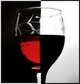
Campariby ThomasComment by Kavey: I'm in two minds about this - on one hand there is the fact that it's such a close copy of a recent entry in a recent challenge - which means the creativity isn't your own - on the other hand I do appreciate that one great way to learn more to to try and emulate the work that one admires. The jury is still somewhat out for me - on balance I think it's great to imitate in order to learn but not so great to then enter the imitation into a challenge as one's own work.
About the image: I like the colour of the red liquid - it has a nice tone to it. My biggest criticism is the choice of glass - I think this kind of shot works best with a plain glass which really plays on the abstract geometric nature of the shapes created - in this case, the dimples and patterns in the cut glass detract from that geometry. |
 Photographer found comment helpful. Photographer found comment helpful. |
| 05/10/2003 04:12:34 PM |
Campariby ThomasComment by ursula: I like this entry, and I particularily like the two b/w border. IMO, for a shot of this kind everything has to be just so, perfect, completely straight, no shadows on the white background - and this one isn't quite there, almost, but not quite. I also think that a plain glass might have worked better than an etched glass. It is, though, one of the better entries in this challenge. (7) |
| Photographer found comment helpful. |
| 05/10/2003 04:47:52 AM |
|
| Photographer found comment helpful. |
| 05/09/2003 09:46:46 PM |
|
| 05/09/2003 05:29:50 AM |
Campariby ThomasComment by sotsot: I swear I saw some similar photo of this....shooting not bad, but idea is "duplicated " 3 |
| 05/09/2003 03:23:39 AM |
Campariby ThomasComment by marco: Nice effect and contrast! My only remark is that the glass isn't very clear at the top. If it weren't for the distracting spots, this image would be a nice '90's design' image. |
| Photographer found comment helpful. |
| 05/09/2003 01:04:24 AM |
|
| Photographer found comment helpful. |
| 05/08/2003 11:29:31 PM |
Campariby ThomasComment by kiwiness: I wondered if anyone would do something like this or not. You are the only one as far as I know. It is good too, although I would like to have seen more of the red in the glass. The blackness is shrouding it out too much around the left side and the bottom. |
| Photographer found comment helpful. |
| 05/08/2003 07:20:20 PM |
|
| 05/08/2003 09:50:27 AM |
Campariby ThomasComment by Becky: I like the ying-yange affect in your photo. It adds to the uniqness of your photo. |
| Photographer found comment helpful. |
Home -
Challenges -
Community -
League -
Photos -
Cameras -
Lenses -
Learn -
Help -
Terms of Use -
Privacy -
Top ^
DPChallenge, and website content and design, Copyright © 2001-2025 Challenging Technologies, LLC.
All digital photo copyrights belong to the photographers and may not be used without permission.
Current Server Time: 04/16/2025 01:43:48 PM EDT.