Skateboardby
g3designComment by LalliSig: Greetings from the Critique Club :)
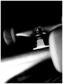
I am going to be a bit harsh but I think you can handle it, anyway, hopefully you value an honest opinion over a false one. The thing that popped straight into my head when I saw this is that I didn´t have a clue as to what I was looking at, and I don´t mean that in a good way like a good abstract, that captures your attention and doesn´t let go because you find it so intriguing that you simply must try and figure out what it was. It simply isn´t composed and lit interestingly, in my humble opinion ofcourse. Regarding the composition, there is just too much black space all around and no area in the shot that directly calls for attention except for that overexposed area that starts in the lower left corner and the front wheel that is in the right part of the frame is just barging in there like an uninvited guest, doesn´t hel at all. Wouldn´t this have been better if you had taken it at another angle and used the line of the side of the skateboard to guide the eye towards the wheels, starting in a lower corner and ending up in a top corner? As for the lighting, it´s too dark in the corners and too bright on the front of the skateboard, overexposing a big chunk of it...
To be honest, I would have voted this a 4. It simply isn´t a "WOW" type photograph and doesn´t seem like it´s very well thought out or that you put a lot of effort into it, just put your skateboard on the floor and blasted away with your flash. The stuff that normally does well here is the stuff that has that wow factor, stuff that stop the voter in his tracks and make him/her say, "wow, that is a beautiful photograph" or what I do constantly, "wow, why didn´t I think of that" :)
Sorry, I think I seem too negative here. I mean, it´s hardly a horrible photograph, I mean, 5 is average for me and 4 below average so it´s hardly that bad either. If you had composed this better, lit it with a more even lightsource things would have been quite different I think and you would have gotten a much better score. It is at least in good focus and quite a bit of people really liked it, you got 27 votes of 7 or higher so you hit the spot for a good deal of your voters and most of them gave it a 5 so it´s hardly bad. I just think you can do a lot better, that´s all :)
As for meeting the challenge, it certainly does so in my eyes but I think (not sure so take this with a grain of salt) that technically "Duotone" means b/w with some other colour, like sepia toned, or green toned and such. While I would have voted it as meeting the challenge and I think that most people did since the challenge description specifically named b/w, I still think that a couple of people must have voted it with very low because it´s not a true duotone. Anyway, a huge challenge and you ended up in the top 10% so that´s pretty well done, now keep at it :)
Welcome to DPC and hopefully this comment will serve as more of a "kick you in the ass and into the groove" rather than stop you from coming here.
Kind regards, Larus.