Nanakuli Blueby
CubComment by jimmsp: Critique Club Critique
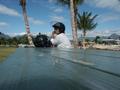
(1) COMPOSITION (CONTENT) - In my opinion, too dominated by the table, since I think you wanted the blue sky here. On the other hand, the wires, poles, and buildings on the far right detract. It would have been interesting if you had rotated to the right more, trying slightly different alignments. Having her off center slightly would probably help.
(2) BACKGROUND � See above. The right hand area should be cropped out.
(3) CAMERA WORK ,TECHNICAL � Good focus & DOF
(4) DIGITAL PROCESSING ,TECHNICAL � I think a crop along the nearer tree on the right, and above the shadow on the table would make a great difference to this. Try a more portrait look.
(5) MY OPINION ON THE PHOTO � I think I get the feeling you were after here � but a different cropping might have helped immensely, turning something above a snapshot into more of a photograph.
Jim msp