What is it?by
Lil_OneComment by taterbug: Greetings from the Critique Club
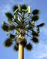
This is your entry in the 'Master of Disguise' challenge. I think you've definitely nailed the topic right on the head. Great choice for this challenge. The subject has a strangely high interest factor I find for some reason. Perhaps because it is fascinating to see this kind of iconic symbol of the rapidly advancing technological world of today erected with the somewhat whimsical camoflage, preventing it from being somewhat of an eyesore. Yes, fascinating.
Technicals are not bad here. Focus is good. Color is good, maybe a slight boost in saturation could be nice, but maybe that is just a matter of taste. Exposure is actually pretty good, considering it looks like it was very bright, harsh lighting. I might suggest here that on a shot like this, it might be a good idea to try different times of the day, to see how different lighting conditions will affect the image. A different angle from the sunlight could allow for a little more detail from the darker portions of the 'leaves', and cut down some on the bright spots on some of the vertical surfaces. The blue of your sky is nice, but again, trying various times could also capture differing skies with more or less features, or 'drama' to them.
Your composition works fine here for the chosen subject I believe. It's good that you've kept it simple and clean. There are no distracting elements at all. In shots like these, often times people will catch wires, or tops of buildings or stray signs and things like that, you've payed close attention to your image, nice job. With this particular sky, I think going with the close, centered framing probably was the best choice. If say, you had a stronger featured sky, lots of clouds and stuff, something to consider would maybe be a more off centered approach, and use some of the sky to your advantage. Something to keep in mind for the future. One minor thing here though, the tower does seem to have a slight tilt to it. A more dramatic, more obvious, sharper angle, and it could seem to be done on purpose, to stress a point of view, or add dynamics to a composition. A slight tilt however, usually will come across as an oversight. It is slight in this case, but some voters have pet peaves about straignt horizons and verticals and such. Plus, it just gives strength to the presentation and adds to the aesthetics of an image. Depending on if you do any editing to your photos, straightening is something that can be done in the editing stage. (your mom could probably show you this, or I believe there is a tutorial on the site's learn section).
Overall, a nice shot. This was a great pick for your subject for this challenge. Fits nicely, and you gave a solid, clean presentation of your idea, and I think people could definitely relate to it, and find some interest there. 5.88 is not a bad score at all. Congrats on your personal best! Keep up the good work, I'm sure you'll have more high scores in your future :-)
If you have any questions, or comments or anything, feel free to contact me.
Happy shooting,
taterbug :-)