Focus on Fruitby
LeejpComment by theSaj: ::: Critique Club ::: [The Saj]
First Impressions:
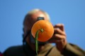
My first impressions with this photo was "wow...that's a cool shot". And I still think that to be the case. ;-)
BTW...I gave this photo a 7 in voting.
-------------------------------------------------------------
Composition:
The composition is strong. Some might object to this photo being very centered, but I think it works in this case. Though you might also want to consider cropping off the top 1/2" and perhaps 2" from the left. This gives it a strong "rule-of-thirds" commitment and seems to make the orange stand out a bit more.
Subject:
Excellent subject. The orange is well placed and very distinct, the long leaf is a great addition (although I notice upon further inspection that I can see a reflection of this, which helps to answer my question about how this shot was composed. I presumed it is an orange set on a mirror with blue ceiling or sky above?)
Of note, the placement of the model's (namely, you the photographer) hand, was well placed, and well posed.
Technical (Colour, focus, and light):
Focus is sharp on the orange and nicely blurred on the photographer. Lighting is good but might be better. The left side of the photographer is a bit dark .
The focus also gives a very 3D feel allowing the orange to simply lift off the photo.
The colours are bright and cheery, with the background colors are a bit more subdued helping the background subjects to nicely fall into the background of the photo and not detract from the main subject.
Creativity: This was a fun photo. Creative, bright, and juicy. ;-)
-------------------------------------------------------------
Summary: A fun photo with good clarity. Perhaps not the best entry category (I imagine it'd have done surprisingly well under "Fruit") but overall not a bad entry for the "shapes" challenge.
To improve?: Try a tight crop, remove a bit of the blue toward that top and most of the portion to the left of the photographer. A few minor distractions, namely the shoulders. On the left there is a dip and a rise again. This creates a distracting element. I also believe lowering your left elbow would have helped by reducing the appearance of the shoulder so as to provide more clear space. There are a few minor artifacts, the most noticeable of which is found on the photographer's hand as it holds the camera...was this reflection? I cannot tell...but it is very minor and expected in basic challenge entry.
You should feel good about this entry, it was a great endeavor!
-------------------------------------------------------------
It is my hope that these insights are helpful, and constructive. If you have any questions regarding this critique, please feel free to PM me.
- Jason "The Saj"