| Image |
Comment |
| 02/05/2006 06:43:02 PM |
Generationsby ecameronComment by AzCKelly: Greetings from the Critique Club
The first thing that strikes me with this picture is the eyes and the emotion emitted from their expressions. There is a magical peace here, The softness in their faces really make me feel very comfortable and brings a smile to my face.
I really like the way the older gentleman is crouched down more than the younger one, he make an invisible line that moves the viewer from him to the younger one with the brighter expression. The direction of their gaze also continues to lead the viewer. The position of the older mans arm is a great touch. It give me a sense of framing or completeness to that area.
Like many have said in other comments, it is a bit flat. The grey tones seem to mute both subjects from the background. Increasing the contrast might help here. The younger mans darker hair gives you a good idea of how a more contrast can really power this up.
The lighting is perfect in my opinion, no harsh areas and the focus is also good.
Its a very good picture overall and after reading your comment behind the picture, I can see how much more precious this is. Message edited by author 2006-02-05 23:44:36. |
 Photographer found comment helpful. Photographer found comment helpful. |
| 02/05/2006 03:20:08 PM |
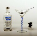
Blueberry Cosmoby ecameronComment by hotpasta: nice shott...looks a little flat to me though...some work on levels and saturation would have really made this shot jump |
| Photographer found comment helpful. |
| 02/05/2006 11:06:50 AM |
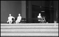
Daily Routineby ecameronComment by Crisik: Out of your portfolio, I like this one best - I tend to prefer b/w pictures, but in addition, it seems to have a style and a story, as other comments suggest.
I did not notice any noise (definitely no inappropriate noise) and actually I do not notice any halo even when told there is one (may be a monitor issue?).
While the central composition underlines the general impression of the statues (static, exposition-like), I would like to know how a non central alternative would look like. My only major objection is the amount of highlights and lack of contrast on the statues and the steps. The statues look almost like white silhouettes, which is probably unintended. Well, may be I'm just looking for an eye candy :-).
Keep on. |
| Photographer found comment helpful. |
| 02/05/2006 06:13:54 AM |
Blueberry Cosmoby ecameronComment by bigfish: the composition of the photo is very good but the line ware the background and the floor meet is very distracting. also the forground is grey, it would look better in white.
good luck |
| Photographer found comment helpful. |
| 02/04/2006 01:11:53 AM |
Blueberry Cosmoby ecameronComment by admart01: try putting your elements into a different arrangement -- they look like they're in a "line up", less equi-distant, vary spacing between them. Your lighting is too flat/dim to bring out the depth of the elements. |
| Photographer found comment helpful. |
| 02/03/2006 02:29:45 PM |
|
| Photographer found comment helpful. |
| 02/02/2006 07:11:32 AM |
|
| Photographer found comment helpful. |
| 02/01/2006 05:45:20 PM |
|
| Photographer found comment helpful. |
| 02/01/2006 04:22:45 PM |
Blueberry Cosmoby ecameronComment by fadedbeauty: Focus seems a little soft and it would probably be better if you got the white background to actually be white. Are the things in the shot glass blueberries? They are much to dark to be able to get any hint of color from them. The composition is overall a little static. All the elements being lined up and completely seperated from each other tends to be a little boring. |
| Photographer found comment helpful. |
| 01/31/2006 10:15:41 PM |
|
| Photographer found comment helpful. |
Home -
Challenges -
Community -
League -
Photos -
Cameras -
Lenses -
Learn -
Help -
Terms of Use -
Privacy -
Top ^
DPChallenge, and website content and design, Copyright © 2001-2025 Challenging Technologies, LLC.
All digital photo copyrights belong to the photographers and may not be used without permission.
Current Server Time: 04/15/2025 01:43:47 PM EDT.