DPChallenge: A Digital Photography Contest You are not logged in. (log in or register
 
Browse Settings
Currently viewing:
Registered Useralih

Show comments:

Per page:

Order:

Comments:


Comments Received by alih
Pages:  
Showing 41 - 50 of ~58
Image Comment
time for breakfast
11/17/2005 11:20:32 AM
time for breakfast
by alih

Comment by SandyP:
Awwwww. I love this!!! What a sweet model. I have a pretty little calico cat too! She hates having her picture taken tho. As soon as I get the camera out, she gets very determined not to look at me :) That's why I appreciate this one so much!
time for breakfast
11/16/2005 09:40:04 AM
time for breakfast
by alih

Comment by GrayGhost:
Something should be sharp, try a beanbag, tripod, or bumping up ISO.
time for breakfast
11/16/2005 04:32:36 AM
time for breakfast
by alih

Comment by Jutilda:
Beautiful kitty. I like the grainy effect. Maybe the crop is a tad tight. I want to pet that kitty!
Studying for SAT
11/15/2005 04:52:38 AM
Studying for SAT
by alih

Comment by CEJ:
Hello from the Critique Club!

I have studied your image and have the following to offer:

Composition/perspective - the subject to space ratio in this image is very good. This keeps the books on the shelves in the background from becomming a distraction. The crop also is well done. Tight around the face really emphasizes the element of concentration. Not seeing the words on the page helps as well. Nice control of the depth of field. Everything is geared towards keeping the focus strictly on the subject - well done.

Color - the black and white processing in this shot leaves it a little flat. Perhaps a boost in levels and contrast would have helped to separate all the shades of gray. The forearm blends with the shirt which is only a bit lighter than the face. Color may have helped instead of b/w.

Lighting - The book edge/table in the front is a little bright, but the detail is not lost. There are no flares or glares. The image is well lit and has a fairly even cast across the whole image. The lack of shadow on the face demonstrates good control. Well done!

Challenge requirements - with the close crop and strong focus on the subject, the concept of busy is certainly portrayed. The lack of expression is key for this though. With any other expression on your subject's face this would not work.

Overall/my opinion - The composition is done very well, but it lacks in any wow factor of any kind. Slightly different processing to bring out more of the contrast and variations would have helped a bit. There are a lot of areas that the b/w processing could be developed more.
5 Cent Cans?
11/14/2005 10:14:51 AM
5 Cent Cans?
by alih

Comment by elemess:
I don't understand why you played around so much with the colors. I guess blue isn't as "loud" as red, but then you desaturated pretty much everything else. I bet straight b&w would have been a better choice.
5 Cent Cans?
11/10/2005 01:47:06 PM
5 Cent Cans?
by alih

Comment by tpoc:
fun color treatment with the silvers and blues.
5 Cent Cans?
11/09/2005 08:17:48 PM
5 Cent Cans?
by alih

Comment by chet:
I like the different coloring on this one.
5 Cent Cans?
11/09/2005 03:22:45 AM
5 Cent Cans?
by alih

Comment by fplouffe:
I am not sure shifting the red to blue adds anything to the picutre. It sure is original seeing a blue Coke can.
Studying for SAT
11/08/2005 06:23:58 AM
Studying for SAT
by alih

Comment by Britt:
Captured the challenge theme well with great comp. Nice job!
Photographer found comment helpful.
Virginity
11/05/2005 06:42:46 AM
Virginity
by alih

Comment by SteveJ:
Greetings from the Critique Club:

The challenge was 'Delicate', you had to take a photo that conveyed your idea of delicate to the viewers and voters. Virginity, as in your title could be classed as delicate, however it doesn't work for me. Regardless of my opinion, let's discuss the photo.

Technical:
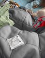
Depth of field is good, it covers most of the items included in the setup. For on camera flash, everything has been exposed well, with no blown highlights. The condom packet looks to be of a reflective material and you did well not to bleach it out as it is the closest item to the camera, hence the flash. You have adhered to the Rule of Third and the use of portrait format was the right one for this photo. There is no information on any processing you did, so I would have to assume that there was minimal or none except for saving for web. Perhaps a little sharpening was used also.

Composition:
Rule of Third used with portrait format. Composition is a bit too cluttered and it takes a bit of time to work out what was going on. An open and empty packet would have worked better IMO, unless of course the subject of the title remained intact.

Overall:
Too busy, less items would have conveyed the message a lot quicker to the voters and hence your score would have been higher. Most voters do not spend much time trying to work out the message, they make a choice very quickly. The focus on the condom packet is spot on and the red underwear - 'G-string?' - is really eye catching and I hope that wasn't worn with the pink bra :) Not a bad attempt for a first challenge entry and I am sure you will move on and upwards from here. Try to keep your backgrounds as simple as possible, your lighting, focus and composition are fine. I hope this is helpful and constrcutive.

Steve
Pages:  
Showing 41 - 50 of ~58


Home - Challenges - Community - League - Photos - Cameras - Lenses - Learn - Help - Terms of Use - Privacy - Top ^
DPChallenge, and website content and design, Copyright © 2001-2025 Challenging Technologies, LLC.
All digital photo copyrights belong to the photographers and may not be used without permission.
Current Server Time: 04/07/2025 11:47:31 AM EDT.