| Image |
Comment |
| 11/03/2006 04:37:35 AM |
Taylorby PaigeComment by h2: composition is too centered, might have been better if she was leaning at the door, crop at bottom is too close to her coat |
 Photographer found comment helpful. Photographer found comment helpful. |
| 11/02/2006 02:24:08 PM |
|
| Photographer found comment helpful. |
| 11/02/2006 11:46:28 AM |
|
| Photographer found comment helpful. |
| 11/02/2006 04:11:04 AM |
Taylorby PaigeComment by code3: If you got in closer this would have been much better. |
| Photographer found comment helpful. |
| 11/02/2006 01:54:54 AM |
Taylorby PaigeComment by hotpasta: compositionally I would have preferred a 'rule of thirds' approach...I don't want to be critical, but her expression looks like she is ticked off |
| Photographer found comment helpful. |
| 11/01/2006 07:25:09 PM |
Taylorby PaigeComment by heathen: tighter crop next time. utilize either the door or the wall, but using both creates a cluttered and distracting background. the graffiti on the wall begs for a grunge treatment here, which in itself wouldn't have worked due to her wardrobe. the gold of the jacket and the red of the wall do not work well together...b+w might have been able to resolve that problem. lighting is flat...just a bit of light on her face will make a huge difference.
none of that means it's a poor shot...this locale and certainly this model have potential. |
| Photographer found comment helpful. |
| 11/01/2006 06:07:51 PM |
Golden Beautyby PaigeComment by karmat: Very lovely young lady. I like her pose and thoughtful look. The lighting is a bit harsh on the right side of the frame, and I think this might detract from the overall "softness" (soft as in gentle attitude, not focus) of the shot. |
| Photographer found comment helpful. |
| 11/01/2006 03:02:58 PM |
|
| Photographer found comment helpful. |
| 11/01/2006 01:27:34 PM |
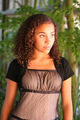
Golden Beautyby PaigeComment by L1: Beautiful model, great light. There are some brighter spots on her face that are a tiny bit distracting. I also find my eyes distracted by the bluish/white areas in the background, particularly on the right side near the bottom, and the dark area on the top left corner. I'd crop in a bit closer on the top and right just to eliminate those areas, or clone in the greenery. She seems very centered and I'd rather have some lead room, particularly on the right side since she's looking into the frame. I also find myself wishing to see either more or less of the arms...the mid-forearm seems like an unnatural place for cropping (but that's just me). |
| Photographer found comment helpful. |
| 11/01/2006 08:52:47 AM |
|
| Photographer found comment helpful. |
Home -
Challenges -
Community -
League -
Photos -
Cameras -
Lenses -
Learn -
Help -
Terms of Use -
Privacy -
Top ^
DPChallenge, and website content and design, Copyright © 2001-2025 Challenging Technologies, LLC.
All digital photo copyrights belong to the photographers and may not be used without permission.
Current Server Time: 04/07/2025 08:58:12 AM EDT.