DPChallenge: A Digital Photography Contest You are not logged in. (log in or register
 
Browse Settings
Currently viewing:
Registered Userucanoe

Show comments:

Per page:

Order:

Comments:


Comments Received by ucanoe
Pages:   ...
Showing 31 - 40 of ~225
Image Comment
After the FALLing rain
11/04/2009 08:48:46 AM
After the FALLing rain
by ucanoe

Comment by abranton:
That grass is so green it is almost distracting. But the fall leaves are beautiful.
Photographer found comment helpful.
After the FALLing rain
11/01/2009 05:59:37 PM
After the FALLing rain
by ucanoe

Comment by NikonJeb:
Lovely colors.....6
Photographer found comment helpful.
After the FALLing rain
10/31/2009 10:45:50 PM
After the FALLing rain
by ucanoe

Comment by ELLIPS:
The saturation is way above the limit IMO. That makes the green very distracting. I would also crop the little green tree left
Photographer found comment helpful.
Another Dam day
10/31/2009 03:34:38 AM
Another Dam day
by ucanoe

Comment by macrothing:


Critique Club Critique

First Impressions
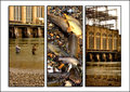
Ah good, I get a Triptych one.

I remember this one and admiring the uniqueness of it, it was also interesting to look at. I gave this a 6.

Photograph Information, Technicals & Composition Review
There seems to be a slight yellowish tinge to the images, which may have something to do with your settings. Perhaps adjusting them just a fraction, as the somewhat muted colors do work, in my opinion. Image selection wise: it would have been nice to see a little more clarity and detail in the middle image, perhaps even a little closer cropped. The fishing reel perhaps cropped out, not sure. I only noticed that this time around and didn't pick it up during voting. My first thought on seeing it this time was that it detracted.

As mentioned above, the images are interesting, especially the story that they tell, also the visible 'HYDRO...', etc. A bit of work, but a slight perspective correction in image #1 perhaps, to get the water level straightened. Overall a little more clarity and detail in all the images, some of the darker areas seem to have been lost, perhaps as a result of using curves/general post processing.

The black borders perhaps compete a little too much for attention with the images and the subtlety of some of the elements within them.

Comments, Score & Placement Review
74/145 is a 'fair' score. 5.68 is a decent enough score.

An average of 6.0 from your commenters: you received some good comments, one especially so, and helpful.

Summary
For three very busy images, this still works. Just some finer post processing and this would have had a little extra, in my opinion.
Another Dam day
10/22/2009 11:33:04 AM
Another Dam day
by ucanoe

Comment by cowboy221977:
Love the title
Another Dam day
10/22/2009 09:08:56 AM
Another Dam day
by ucanoe

Comment by scruff:
Great colour and layout. Good focus too! 8 from me.
Another Dam day
10/21/2009 04:47:36 PM
Another Dam day
by ucanoe

Comment by dtremain:
Nice tones in this image. Wish the center pane was a little more obvious on its subject matter. Perhaps fewer fish, but complete with head and tail. The reel at the top is almost totally lost in the busyness of the center pane.
Another Dam day
10/21/2009 09:38:36 AM
Another Dam day
by ucanoe

Comment by disassociation:
great atmosphere!
Another Dam day
10/21/2009 08:55:10 AM
Another Dam day
by ucanoe

Comment by paynekj:
Interesting images, but I'm not keen on the drop shadows
Sky Blue Pink
10/18/2009 04:04:27 PM
Sky Blue Pink
by ucanoe

Comment by poser:
what a view
Pages:   ...
Showing 31 - 40 of ~225


Home - Challenges - Community - League - Photos - Cameras - Lenses - Learn - Help - Terms of Use - Privacy - Top ^
DPChallenge, and website content and design, Copyright © 2001-2025 Challenging Technologies, LLC.
All digital photo copyrights belong to the photographers and may not be used without permission.
Current Server Time: 04/14/2025 09:13:24 AM EDT.