| Image |
Comment |
| 03/12/2006 05:49:32 AM |
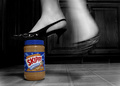
Skippy: It Gives Every Woman a Lift!by liebeComment by Jutilda: Interesting. I think I'd like the peanut butter jar to be black and white as well. Being in color, it draws the eye to the distracting floor squares. Clever though, with the movement stopped - and the blur of the one foot. |
 Photographer found comment helpful. Photographer found comment helpful. |
| 03/12/2006 02:14:19 AM |
Skippy: It Gives Every Woman a Lift!by liebeComment by Bud: Nice selective desat... I would have cropped out the right half of the image (the blurry foot) and drawn more attention to the fancy shoe & PB. It would have been stronger, I think. |
| Photographer found comment helpful. |
| 03/12/2006 12:35:53 AM |
|
| Photographer found comment helpful. |
| 03/11/2006 08:06:35 PM |
|
| Photographer found comment helpful. |
| 03/06/2006 08:39:27 AM |
Clichéby liebeComment by hopper: Greetings from the Critique Club!
I've always liked this type of shot. And having tried it myself, I know how difficult it is to achieve. This is a very respectable take on it. I like the colors, although the blue seems to glow just a bit too much for my liking. The image is sharp and the centered composition works here because of the subject.
On the down side, I see three colors - blue, black, and dark grey. I suppose it could be argued that dark grey is just a tone of black, but in a specific duotone challenge, this may have hurt your score a bit. Also, the grey of the base makes the image seem just a little ... "off". The best photoshop is photoshop that can't be detected, and this particular part is a little too obvious, in my opinion.
Still, it's a very pleasing image. Well done.
milo |
| Photographer found comment helpful. |
| 03/01/2006 03:10:22 PM |
Material Worldby liebeComment by Neuferland: Greetings from the Critique Club!
Well, as someone who actually lived in the 80's (graduated high school in 1980) I would say you did very well in capturing the look of the time.
When this first came up in the challenge I thought, "WOW! That could have been my older sister getting ready to go out!" Not to bad for someone who wasn't even alive during that time! :)
Now to the picky part. I like the tight crop, it really brings the subject in close and fills the frame. That works for me on this shot. Looks like a good use of the rule of thirds in this shot.
There are only two little things that really bother me about this shot overall. One is the lips. For some reason, the open lips and the way the lipstick is applied just doesn't look right. If you were applying mascara or lipstick that pose would work, but the when I applie blush my lips were closed so I could see the natural cheek bone line. But that's me. But also the very distinct lines, very precise, almost too precise, the lines just bothers me for some reason.
Second was the lighting, it is just a tad too dark, just a touch more lighting so it would look more like a make up mirror or lighting you might use to put make up on would really make this pop and bring out the colors.
Other than that, great shot, hope my comments help and good luck in future challenges!
Deannda |
| Photographer found comment helpful. |
| 02/26/2006 03:12:17 PM |
|
| Photographer found comment helpful. |
| 02/26/2006 12:37:21 PM |
Clichéby liebeComment by 3DsArcher: Yes it is at dpc but you appear to have taken a slightly different approach to othe examples I have seen. The base of the glass appears to be suspended in mid air. I am guessing you have inverted the photograph. Either way, I really like the effect & its so good to see a bit more colour than shades of B&W |
| Photographer found comment helpful. |
| 02/26/2006 08:09:54 AM |
|
| Photographer found comment helpful. |
| 02/25/2006 05:32:05 PM |
Clichéby liebeComment by Evaan: I like the crisp, clean lines and graphic arts look of this. Well lit. Nicely done. 7 |
| Photographer found comment helpful. |
Home -
Challenges -
Community -
League -
Photos -
Cameras -
Lenses -
Learn -
Help -
Terms of Use -
Privacy -
Top ^
DPChallenge, and website content and design, Copyright © 2001-2025 Challenging Technologies, LLC.
All digital photo copyrights belong to the photographers and may not be used without permission.
Current Server Time: 04/17/2025 07:29:53 AM EDT.