Cool Breezeby
ncfellerComment by CEJ: Hello from the Critique Club!
I have studied your image and have the following to offer:
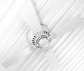
Composition/perspective - taking a quick glance as voters may have, at first it looks a little awkward. It takes a good look to appreciate the composition of this image. The angle is nice and creates an interesting perspective. It does make me feel as though I am looking up at the ceiling which is a very nice effect. It almost appears as though the fan is hanging on a wall instead of from a ceiling. The center of the fan being slightly off center is perfect while keeping the whole fan in the shot. As a whole I think this combination works quite well. Nice job!
Color - obviously in light on white I do not expect to see a lot of color. In this shot you have managed to keep the shades of gray very narrow in spectrum, keeping a lot of them just off white shades as opposed to light gray shades. Not sure if this was done in processing or in camera, but it is a nice effect.
Lighting - this appears as though only natural light was used based on the reflections in the center of the motor housing...the shadows are minimal and there are no real glares or flares except in the upper left of the shot. This area appears blown out and you lose definition of the fan blade into the background. This is the weakest part of the image. The rest appears well controlled. The lower right starts to get a bit bright, but all the detail is still present. Some of this may have been processing. The small dark ovals on the housing are a nice offset to the rest of the image while not hurting it in the least.
Challenge requirements - this certainly meets the challenge requirements quite well. I think this may have not done as well as it could have because of the perspective. As stated above, at first glance it is a hard angle to look at and a bit disorienting. After that I think most people probably looked at the blown out area and moved on. The subject matter is not very interesting, so adding something as one commentor sugggested may have worked better - slow rotate and perhaps some motion blur; perhaps get the pull chain swinging so it is at an angle as well...give the impression of a tilted ceinling and not just an angled shot.
Overall/my opinion - this could have been a much stronger image with a little less brighness/contrast applied. The natural light itself would have left the image white. Perhaps the shadows would have been a bit darker, but I don't think that would have hurt it too much. It is also very static. Something to bring a motion element may have helped.