| Image |
Comment |
| 04/28/2003 08:04:13 AM |
|
 Photographer found comment helpful. Photographer found comment helpful. |
| 04/28/2003 07:09:44 AM |
|
| 04/28/2003 05:23:46 AM |
|
| Photographer found comment helpful. |
| 04/27/2003 09:50:45 PM |
|
| Photographer found comment helpful. |
| 04/27/2003 09:25:06 PM |
|
| Photographer found comment helpful. |
| 04/27/2003 08:55:31 PM |
|
| Photographer found comment helpful. |
| 04/27/2003 08:29:45 PM |
|
| Photographer found comment helpful. |
| 04/22/2003 12:47:59 PM |
Simply Sinfulby GekkerComment by FranziskaLang: A Comment From The Critique Club
Hi Carey,
I'm not a big fan of Hershey's kisses, but you did manage to pick the one that I like best for your photo :) I really like the negative space and the reflection you used here. The background is flawless (nothing to distract), and so is the focus on the photo overall. The reflection from your lightsource on the kiss is a little stronger than I would like (you could fix that with some tissue paper between the light source and your subject and extended exposure time). I wonder what this would like with the little almond tag to the right (or alternatively with the negative space to the left of the kiss). At the moment, my eye wanders up that flag and follows its direction straight out of the picture.
All of these are smaller things though, overall, I like the very simple, almost elegant approach you took for the photo, which is underscored by you picking a golden-brown kiss rather than one of the more brightly colored ones. Definitely meets the challenge, and, based on the score, was well received. And deservedly so.
Just read through the comments, I think DennisF nailed it with the negative space. Since your background is so nice and evenly black, try cropping the right side and then extending your canvas (set it to black) to the left. See if you like it :)
Please let me know if you have any questions or comments about this review.
Franziska |
| Photographer found comment helpful. |
| 04/19/2003 06:59:12 PM |
Simply Sinfulby GekkerComment by LindaLee: Great shot, the color is very nice, focus and composition are good. I kinda feel that I would have preferred to see this in "portrait" format. |
| Photographer found comment helpful. |
| 04/19/2003 02:09:37 PM |
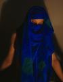
Feeling Blueby GekkerComment by floyd: Greetings from the Critique Club
Perhaps I'm way off the mark here but this looks to me like a picture with a message. A message perhaps about the middle east - perhaps the wars in Afganistan or Iraq. There's the middle eastern style of dress with the covered face (burqa?), the blue which to us westerners suggests sadness and the subject's pose which is, to me, reminiscent of Mary. This all leads to thoughts of the plight of common people in those countries, particularly as the west makes war on their leaders. If I'm right this is a VERY strong concept for your submission and an excellent interpretation of the challenge and I applaud you for it.
Technically I think there are a couple of things that could be improved and both are related to your lighting. First of all it's very dark. I believe you were trying to get that lovely kind of glow on your subject's skin but I don't think you've exposed the shot long enough for that. The other thing is the strong shadow in the background which is rather overpowering. Or perhaps it's supposed to be there and I've not figured out why. Removing the shadow would have meant moving your face lighting higher and more to one side and perhaps having another light shining across the background.
This also leads me onto the setup of your shot which seems excellent all except for the green patches on the blue cloth which look too modern and as one of your commenters said 'break the mood'. However, you really did capture some lovely shadows and highlights on the cloth there.
Overall I find this a *very* interesting picture. I really hope I've interpreted your picture correctly. I always award extra marks for a photo that shows some intelligence or intent and this scores very well indeed in my book. Well done.
John |
| Photographer found comment helpful. |
Home -
Challenges -
Community -
League -
Photos -
Cameras -
Lenses -
Learn -
Help -
Terms of Use -
Privacy -
Top ^
DPChallenge, and website content and design, Copyright © 2001-2025 Challenging Technologies, LLC.
All digital photo copyrights belong to the photographers and may not be used without permission.
Current Server Time: 04/09/2025 05:27:23 AM EDT.