| Image |
Comment |
| 10/14/2005 04:47:05 AM |
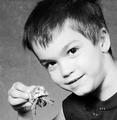
Proud Fatherby holyfamComment by Jutilda: This is a cute picture, but it seems out of focus and overexposed. I'd like to see more texture, light and shadow variance on the boy's face. Tack sharp focus is essential for an effective portrait (and any photo for that matter). Maybe work on lighting so it's not so harsh. Or do it outside with early morning or late evening light. The crop is good and the crab adds a nice "boy" touch to it. |
 Photographer found comment helpful. Photographer found comment helpful. |
| 10/14/2005 12:33:22 AM |
|
| Photographer found comment helpful. |
| 10/13/2005 08:45:41 PM |
|
| Photographer found comment helpful. |
| 10/12/2005 09:00:35 PM |
Victoryby holyfamComment by Maverick: Great expression and angle, would be stronger imho if the left hand wasn't cut out, though it does look ok as it's not cropped right at the wrist. The bright colors add impact as well. |
| Photographer found comment helpful. |
| 10/12/2005 01:14:11 AM |
|
| Photographer found comment helpful. |
| 10/11/2005 01:33:31 PM |
Victoryby holyfamComment by tpoc: i like the dof and colors in this shot. the composition is nice. the angle of the shot make her left arm look abnormally long/large. |
| Photographer found comment helpful. |
| 10/11/2005 11:32:54 AM |
|
| 10/11/2005 09:32:57 AM |
|
| Photographer found comment helpful. |
| 10/08/2005 02:27:25 PM |
African Violetby holyfamComment by HVGB_photos: The complementary colours I see in your image are yellow/violet, but the addition of the strong green from the leaves of the plant change the effect of the complementary colours.
Complementary colours are pairs of colours that contrast strongly when compared to each other. The main colours in your image are yellow and violet.
I think your photo would have been stronger if you could somehow have de-emphasized the green or else shot the photo with just the blossoms and not the leaves. |
| Photographer found comment helpful. |
| 10/07/2005 04:46:39 PM |
African Violetby holyfamComment by CNovack: Brilliant bold colors on the yellows, purples and yes, greens. The lighting is very good. Techniqually good but the composition is weak. The only thing that weakens the strength of the shot is that the straight eye level shot does not hold the eye's interest for long. It has no 'umph' or pizzaz that makes it unique. A change in shooting angle (i.e. a side shot with the camera looking up at this floral arangement) can add a whole new dimension/ a new way of looking at this flower that will make the viewer stop, stare, and smell the flowers. |
| Photographer found comment helpful. |
Home -
Challenges -
Community -
League -
Photos -
Cameras -
Lenses -
Learn -
Help -
Terms of Use -
Privacy -
Top ^
DPChallenge, and website content and design, Copyright © 2001-2025 Challenging Technologies, LLC.
All digital photo copyrights belong to the photographers and may not be used without permission.
Current Server Time: 04/07/2025 11:50:59 AM EDT.