Historyby
A ShrubberyComment by CEJ: Hi from the Critique Club!
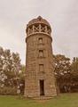
I viewed this image at a few different resolutions and have some observations to share. First, I think this is a great subject. There is a lot of detail and texture just waiting to be brought out in the image. I think this image has a lot of potential with a few processing changes. I actually downloaded the image and applied a few and was amazed at how good this really is.
First, composition/perspective - the subject sits right in the middle of the shot with the only thing to offest the balance being the small sign (?) on the left. I will assume this is not a full size crop and my first suggestion would be to off center the subject just a bit. Apply the rule of thirds. A tighter crop of the top - less sky - would also help this image. But your placement is great - it makes the tower appear taller than it really is. Nice job on that.
Lighting - all natural obviously. But it appears flat. The sky is a little bland compared to the rest of the image. Again a tighter crop on top would have eliminated that and made your subject stand out even more.
Color - the stones in the tower have a lot of natural variation that would stand out more with some processing (below). But the balance is good. Not too much green, but enough to make the browns of the stone give a good contrast.
Processing - when I said it appears flat I was referring to the processing mainly. This image has a lot of good tonal qualities that just have not been brought out. A look at the histogram for this image as you have submitted shows a nice bell curve with only a few abberrations. Moving the black and white levels to be within the slopes of the curves brings out so much more detail and color alone. With the tighter crop this would have made it 'pop'. After the levels, a slight adjustment of the contrast would emphasize the tonal differences in the stone that would make your subject really stand out. Going even further and applying a slight adjustment to the saturation would really make it stand out. Some sharpening to emphasize the stone detail and you have a fantastic image.
As for the challenge...I think after the processing you could think about adding the image grain. This could be done in a number of ways - adding noise, adding film grain (not available in all editors), using any number of filters/actions for PhotoShop or other processors. But if the processing is done first, the grain would add to the image as it already appears 'old'. Another idea to try would be processing it in black and white or even sepia tones.
Overall a nice image that just lacked the post processing that would make it pop. You seem to have a good eye for the capture and subject matter.
This image has a lot of potential and you should in no way be discouraged by its performance in the challenge.